Image Hover Effects code:
1.index.html:
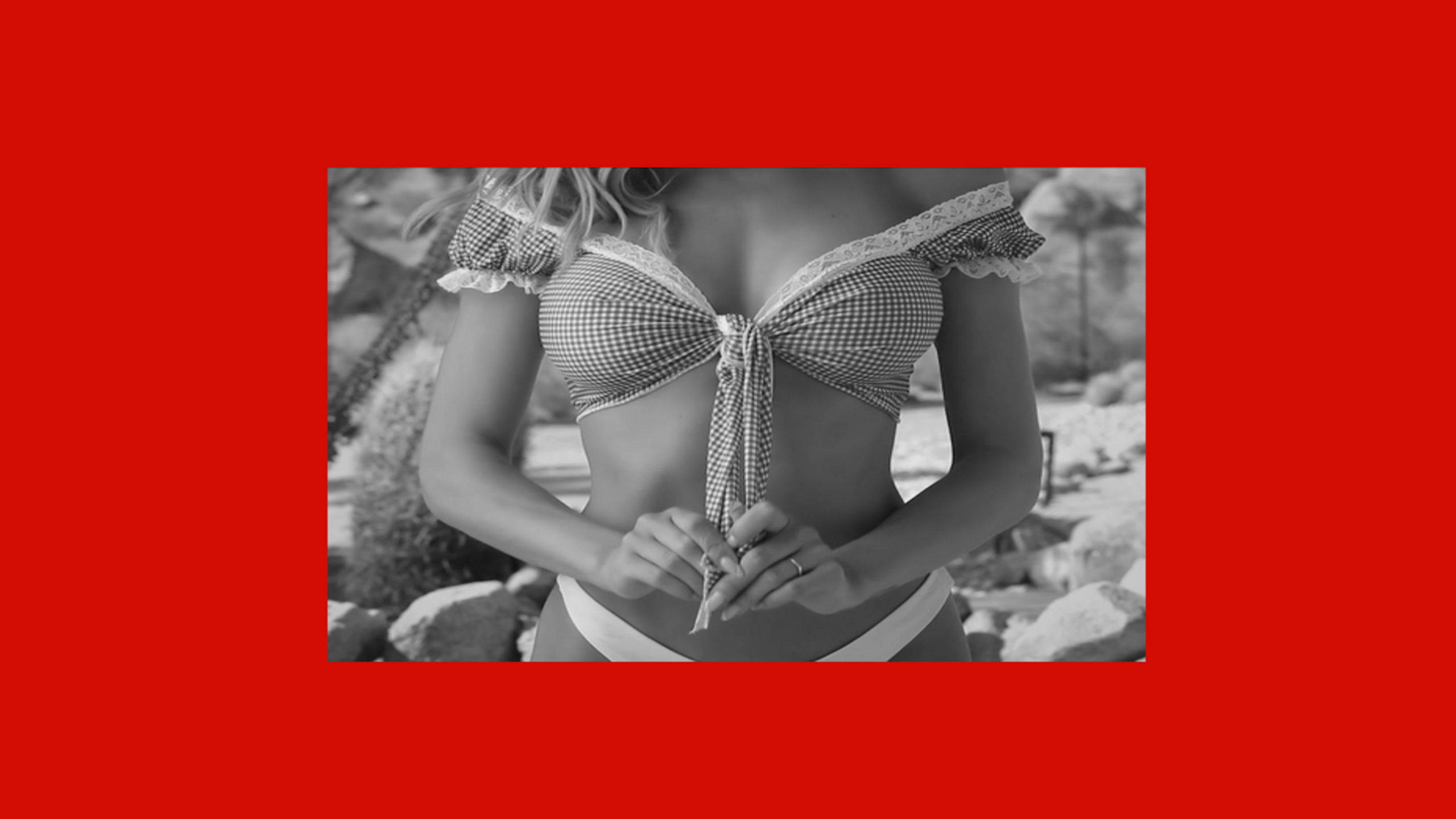
<!DOCTYPE html> <html> <head> <meta charset="UTF-8"> <title>Image Hover Effects</title> <link rel="stylesheet" href="style.css"> </head> <body> <div class="center"> <div class="box"> <div class="image"> <img src="image4.jpg"> </div> <div class="content"> <h1>Visual Code</h1> <p>Lorem ipsum dolor, sit amet consectetur adipisicing elit. Deleniti beatae nam qui earum ex, id dolorum ipsum! Soluta modi autem libero nobis velit vero doloribus, similique, natus perspiciatis facere at?</p> </div> </div> </div> </body> </html>
2.style.css:
body { margin: 0; padding: 0; font-family: Verdana, Geneva, Tahoma, sans-serif; background: black; } .center { position: absolute; top: 50%; left: 50%; transform: translate(-50%,-50%); } .box { position: relative; width: 300px; height: 450px; background: transparent; padding: 20px; border: 1px solid white; } .image { position: absolute; width: 100%; height: 100%; background: black; z-index: 2; transform-origin: left; transition: 1s; transform: perspective(2000px) rotateY(0deg); } .image img { width: 100%; } .content { position: absolute; width: 100%; height: 100%; background: white; z-index: 1; transform-origin: left; transition: 1s; transform: perspective(2000px) rotateY(90deg); padding: 25px; box-sizing: border-box; text-align: justify; } .box:hover .image { transform: perspective(2000px) rotateY(-90deg); } .box:hover .content { transform: perspective(2000px) rotateY(0deg); }
