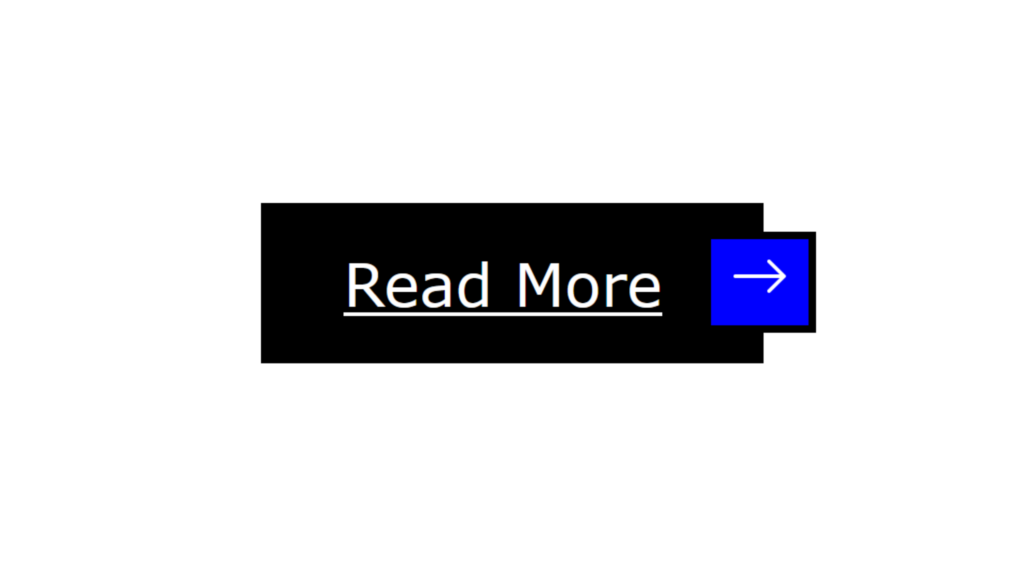
Button Read More Hover Effect Code:
1.index.html:
<!DOCTYPE html> <html> <head> <meta charset="UTF-8"> <title>Button Hover Effect</title> <link rel="stylesheet" href="style.css"> <link rel="stylesheet" href="https://cdn.jsdelivr.net/npm/@fortawesome/fontawesome-free@6.1.1/css/fontawesome.min.css"> </head> <body> <a href="#"><span></span>Read More<span><svg xmlns="http://www.w3.org/2000/svg" width="16" height="16" fill="currentColor" class="bi bi-arrow-right" viewBox="0 0 16 16"> <path fill-rule="evenodd" d="M1 8a.5.5 0 0 1 .5-.5h11.793l-3.147-3.146a.5.5 0 0 1 .708-.708l4 4a.5.5 0 0 1 0 .708l-4 4a.5.5 0 0 1-.708-.708L13.293 8.5H1.5A.5.5 0 0 1 1 8z"/> </svg></span></a> </body> </html>
2.style.css:
body { margin: 0; padding: 0; font-family: Verdana, Geneva, Tahoma, sans-serif; } a { position: absolute; top: 50%; left: 50%; transform: translate(-50%,-50%); padding: 10px 25px 10px 20px; border: 2px solid black; color: black; transition: 0.5s; } a span:nth-child(1) { position: absolute; top: 0; left: 0; width: 100%; height: 100%; } a span:nth-child(1)::before { content: ''; position: absolute; top: 0; left: 0; width: 100%; height: 100%; background: black; z-index: -1; transform: scale(0); transition: 0.5s; } a:hover { color: white; } a:hover span:nth-child(1)::before { transform: scale(1); } a span:nth-child(2) { position: absolute; top: 50%; right: -16px; display: block; transform: translateY(-50%); padding: 2px 5px; border: 2px solid black; background: white; } a span:nth-child(2)::before { content: ''; position: absolute; top: 0; left: 0; width: 100%; height: 100%; background: blue; z-index: -1; transition: 0.5s; transform: scale(0); } a:hover span:nth-child(2)::before { transform: scale(1); }

