
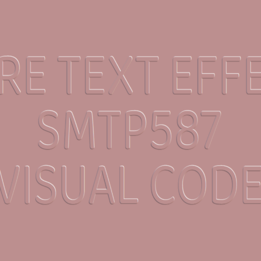
Text Animation Code:
1.index.html:
<!DOCTYPE html> <html> <head> <meta charset="UTF-8"> <title>Text Animation</title> <link rel="stylesheet" href="style.css"> <body> <ul> <li>a</li> <li>n</li> <li>i</li> <li>m</li> <li>a</li> <li>t</li> <li>i</li> <li>o</li> <li>n</li> </ul> </body> </html>
2.style.css:
@import url('https://fonts.googleapis.com/css2?family=Baloo+Chettan+2:wght@400;800&family=Fascinate&family=Kdam+Thmor+Pro&family=Oleo+Script+Swash+Caps&family=Oswald:wght@200&family=Sigmar+One&display=swap'); body { margin: 0; padding: 0; background: red; font-family: 'Oleo Script Swash Caps', cursive; } ul { position: absolute; top: 50%; left: 50%; transform: translate(-50%,-50%) skewY(-8deg); display: flex; margin: 0; padding: 0; background: green; box-shadow: 0 0 0 10px white; overflow: hidden; } li { display: block; list-style: none; color: white; padding: 0 10px; font-size: 4em; text-transform: uppercase; animation: animate 3s linear infinite; } @keyframes animate { 0% { transform: translateY(-100px) rotateY(0deg); } 20% { transform: translateY(0px) rotateY(360deg); } 40% { transform: translateY(-10px) rotateY(360deg); } 50% { transform: translateY(0px) rotateY(360deg); } 60% { transform: translateY(-10px) rotateY(360deg); } 70% { transform: translateY(0px) rotateY(360deg); } 80% { transform: translateY(0px) rotateY(360deg); } 100% { transform: translateY(100px) rotateY(720deg); } } li:nth-child(1) { animation-delay: 0.1s; } li:nth-child(2) { animation-delay: 0.2s; } li:nth-child(3) { animation-delay: 0.3s; } li:nth-child(4) { animation-delay: 0.4s; } li:nth-child(5) { animation-delay: 0.5s; } li:nth-child(6) { animation-delay: 0.6s; } li:nth-child(7) { animation-delay: 0.7s; } li:nth-child(8) { animation-delay: 0.8s; } li:nth-child(9) { animation-delay: 0.9s; }

