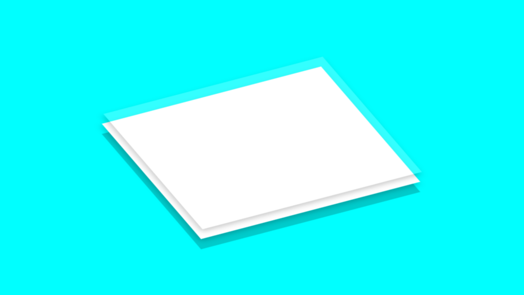
Isometric Glass Layered Box Code:
1.index.html:
<!DOCTYPE html> <html> <head> <meta charset="UTF-8"> <title>Isometric Glass Layered Box</title> <link rel="stylesheet" href="style.css"> <body> <div class="center"> <div class="box"></div> <div class="shadow"></div> </div> </body> </html>
2.style.css:
body { margin: 0; padding: 0; background: aqua; } .center { position: absolute; top: 50%; left: 50%; transform: translate(-50%,-50%); width: 400px; height: 300px; } .box { width: 100%; height: 100%; position: absolute; top: 0; left: 0; background: white; box-shadow: -5px 5px 10px rgba(0,0,0,0.2); transform: rotate(-40deg) skewY(25deg); transition: 0.5s; } .box:hover { top: 20px; box-shadow: none; } .box::before { content: ''; position: absolute; top: -20px; left: 15px; width: 100%; height: 100%; background: rgba(255,255,255,0.2); box-shadow: -5px 5px 10px rgba(0,0,0,0.2); transition: 0.5s; } .box:hover::before { top: 0; left: 0; box-shadow: none; } .shadow { width: 100%; height: 100%; background: rgba(0,0,0,0.2); position: absolute; top: 20px; left: 0; z-index: -1; transform: rotate(-40deg) skewY(25deg); transition: 0.5s; } .box:hover ~ .shadow { box-shadow: -2px 2px 5px rgba(0,0,0,0.2); }
