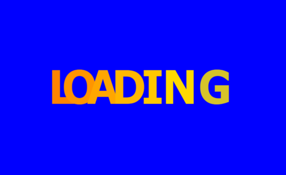
Loading Text Animation code: 1.index.html: <!DOCTYPE html> <html> <head> <meta charset="UTF-8"> <title>Loading Text Animation</title> <link rel="stylesheet" type="text/css" href="style.css"> </head> <body> <ul> <li>L</li> <li>O</li> <li>A</li> <li>D</li> <li>I</li> <li>N</li> <li>G</li> </ul> </body> </html> 2.style.css: body { margin: 0; padding: 0; font-family: Verdana, Geneva, Tahoma, sans-serif; font-weight: bold; background: blue; } ul { […]
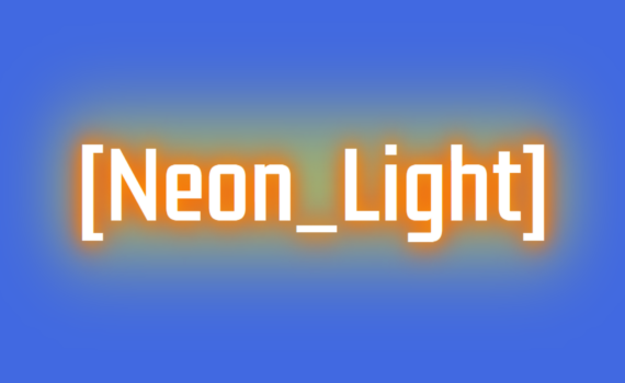
Neon Light Text Effect code: 1.index.html: <!DOCTYPE html> <html> <head> <meta charset="UTF-8"> <title>Neon Light Text Effect</title> <link rel="stylesheet" type="text/css" href="style.css"> </head> <body> <h1 class="neon" data-text="[Neon_Light]">[Neon_Light]</h1> </body> </html> 2.style.css: @import url('https://fonts.googleapis.com/css2?family=Fascinate&family=Kdam+Thmor+Pro&family=Oswald:wght@200&display=swap'); body { margin: 0; padding: 0; background: royalblue; background-size: cover; font-family: 'Kdam Thmor Pro', sans-serif; } .neon { position: absolute; […]

Stitched Box Design code: 1.index.html: <!DOCTYPE html> <html> <head> <meta charset="UTF-8"> <title>Stitched Box Design</title> <link rel="stylesheet" type="text/css" href="style.css"> </head> <body> <h1 class="stitched">Stitched</h1> </body> </html> 2.style.css: body { margin: 0; padding: 0; background: pink; } .stitched { position: absolute; top: 50%; left: 50%; transform: translate(-50%,-50%); font-size: 10em; margin: 0; padding: 10px […]
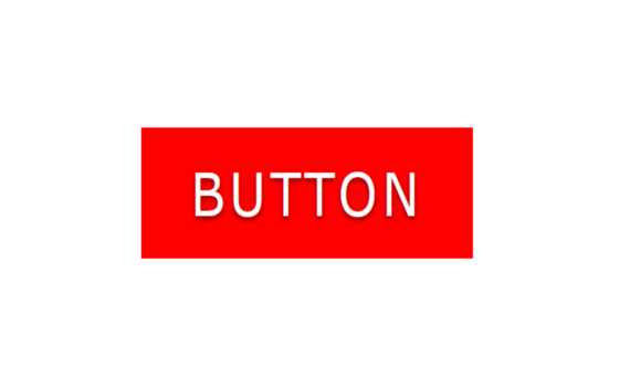
Button Hover Effect code: 1.index.html: <!DOCTYPE html> <html> <head> <meta charset="UTF-8"> <title>Button Hover Effect</title> <link rel="stylesheet" href="style.css"> </head> <body> <a href="#" data-text="button">Button</a> </body> </html> 2.style.css: body { margin: 0; padding: 0; } a { position: absolute; top: 50%; left: 50%; transform: translate(-50%,-50%); padding: 10px 20px; font-family: Verdana, Geneva, Tahoma, sans-serif; […]
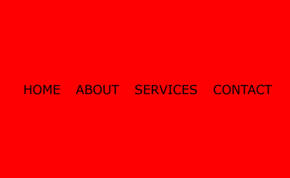
Menu Hover Effect code: 1.index.html: <!DOCTYPE html> <html> <head> <meta charset="UTF-8"> <title>Menu Hover Effect</title> <link rel="stylesheet" type="text/css" href="style.css"> </head> <body> <ul> <li><a href="#">Home</a></li> <li><a href="#">About</a></li> <li><a href="#">Services</a></li> <li><a href="#">Contact</a></li> </ul> </body> </html> 2.style.css: body { margin: 0; padding: 0; font-family: Verdana, Geneva, Tahoma, sans-serif; background: red; } ul { position: […]

Background Color Animation code: 1.index.html: <!DOCTYPE html> <html> <head> <meta charset="UTF-8"> <title>Background Color Animation</title> <link rel="stylesheet" href="style.css"> </head> <body> <ul> <li></li> <li></li> <li></li> <li></li> <li></li> <li></li> <li></li> <li></li> <li></li> <li></li> </ul> </body> </html> 2.style.css: body { margin: 0; padding: 0; } ul { position: absolute; top: 0; left: 0; margin: […]

Smoke Animation code: 1.index.html: <!DOCTYPE html> <html> <head> <meta charset="UTF-8"> <title>Smoke Animation</title> <link rel="stylesheet" type="text/css" href="style.css"> </head> <body> <ul> <li></li> <li></li> <li></li> <li></li> <li></li> <li></li> <li></li> <li></li> <li></li> <li></li> </ul> </body> </html> 2.style.css: body { margin: 0; padding: 0; } ul { position: absolute; bottom: 0; left: 50%; transform: translateX(-50%); […]
3D Image Layer Flip code: 1.index.html: <!DOCTYPE html> <html> <head> <meta charset="UTF-8"> <title>3D Image Layer Flip</title> <link rel="stylesheet" type="text/css" href="style.css"> </head> <body> <div class="box"></div> </body> </html> 2.style.css: body { margin: 0; padding: 0; background: url(666.jpg); } .box { position: absolute; top: 50%; left: 50%; transform: translate(-50%,-50%); width: 400px; height: 300px; […]
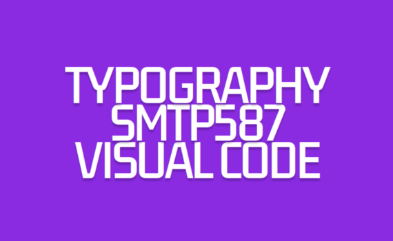
Typography code: 1.index.html: <!DOCTYPE html> <html> <head> <meta charset="UTF-8"> <title>Typography</title> <link rel="stylesheet" type="text/css" href="style.css"> </head> <body> <div class="center"> <div class="text textblock1">Typography</div> <div class="text textblock2">smtp587</div> <div class="text textblock3">visual code</div> </div> </body> </html> 2.style.css: @import url('https://fonts.googleapis.com/css2?family=Kdam+Thmor+Pro&family=Oswald:wght@200&display=swap'); body { margin: 0; padding: 0; background: blueviolet; font-family: 'Kdam Thmor Pro', sans-serif; } .center { […]
Image Fill Color code: 1.index.html: <!DOCTYPE html> <html> <head> <meta charset="UTF-8"> <title>Image Fill Color</title> <link rel="stylesheet" type="text/css" href="style.css"> </head> <body> <div class="container"> <div class="imageBox grey"><img src="587.png"></div> <div class="imageBox color"><img src="587.png"></div> </div> </body> </html> 2.style.css: body { margin: 0; padding: 0; background: black; } .container { position: absolute; top: 50%; left: […]