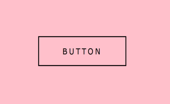
Border Around Button Hover Effect code: 1.index.html: <!DOCTYPE html> <html> <head> <meta charset="UTF-8"> <title>Border Around Button</title> <link rel="stylesheet" type="text/css" href="style.css"> </head> <body> <a href="#">Button <span></span> <span></span> <span></span> <span></span> </a> </body> </html> 2.style.css: body { margin: 0; padding: 0; background: pink; } a { position: absolute; top: 50%; left: 50%; transform: […]

Rain Animation code: 1.index.html: <!DOCTYPE html> <html> <head> <meta charset="UTF-8"> <title>Rain Animation</title> <link rel="stylesheet" type="text/css" href="style.css"> </head> <body> <div class="rain"></div> </body> </html> 2.style.css: body { margin: 0; padding: 0; background: url(city.png); background-size: cover; background-repeat: no-repeat; } .rain { height: 100vh; background: url(rain.png); animation: rain 4s linear infinite; } .rain::before { […]
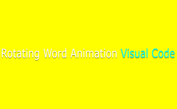
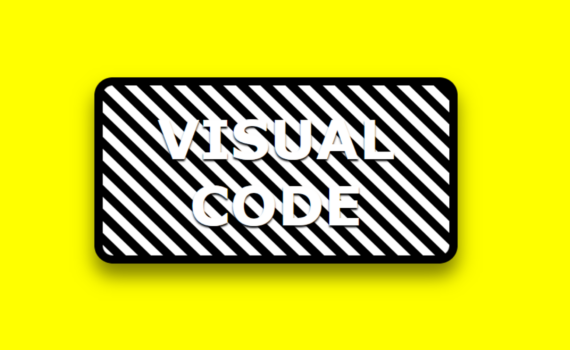
Rotating Word Animation code: 1.index.html: <!DOCTYPE html> <html> <head> <meta charset="UTF-8"> <title>Rotating Word</title> <link rel="stylesheet" type="text/css" href="style.css"> </head> <body> <div class="box"> Rotating Word Animation <div class="word"> <span>Rotating</span> <span>Word</span> <span>Animation</span> <span>Visual Code</span> </div> </div> </body> </html> 2.style.css: body { margin: 0; padding: 0; background: yellow; } .box { position: absolute; top: […]
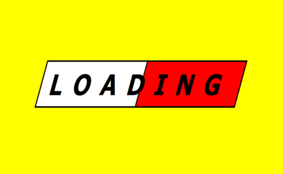
Loading Animation code: 1.index.html: <!DOCTYPE html> <html> <head> <meta charset="UTF-8"> <title>Loading Animation</title> <link rel="stylesheet" type="text/css" href="style.css"> </head> <body> <div class="loading"> <h1>Loading</h1> </div> </body> </html> 2.style.css: body { margin: 0; padding: 0; background: yellow; } .loading { position: absolute; top: 50%; left: 50%; transform: translate(-50%,-50%) skewX(-20deg); width: 300px; height: 50px; background: […]
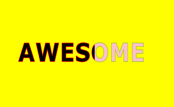
Awesome Text Hover Effect code: 1.index.html: <!DOCTYPE html> <html> <head> <meta charset="UTF-8"> <title>Awesome Text Hover Effect</title> <link rel="stylesheet" type="text/css" href="style.css"> </head> <body> <h1 data-text="Awesome">Awesome</h1> </body> </html> 2.style.css: body { margin: 0; padding: 0; background: yellow; } h1 { position: absolute; top: 50%; left: 50%; transform: translate(-50%,-50%); font-size: 6em; font-family: Verdana, […]
Sprite Animation code: 1.index.html: <!DOCTYPE html> <html> <head> <meta charset="UTF-8"> <title>Sprite Animation</title> <link rel="stylesheet" href="style.css"> </head> <body> <div class="box"></div> </body> </html> 2.style.css: body { margin: 0; padding: 0; } .box { position: absolute; top: 50%; left: 50%; transform: translate(-50%,-50%); width: calc(900px / 8); height: 199px; background: url(456.png); animation: animate 1s […]

Phone Pulse Animation code: 1.index.html: <!DOCTYPE html> <html> <head> <meta charset="UTF-8"> <title>Pulse Animation</title> <link rel="stylesheet" type="text/css" href="style.css"> <link rel="stylesheet" href="https://cdnjs.cloudflare.com/ajax/libs/font-awesome/4.7.0/css/font-awesome.min.css"> </head> <body> <div class="pulse"> <i class="fa fa-phone" style="font-size:48px;color:white"></i> </div> </body> </html> 2.style.css: body { margin: 0; padding: 0; background: black; } .pulse { position: absolute; top: 50%; left: 50%; transform: […]
Animated Gradient code: 1.index.html: <!DOCTYPE html> <html> <head> <meta charset="UTF-8"> <title>Animated Gradient</title> <link rel="stylesheet" type="text/css" href="style.css"> </head> <body> <div class="box"> <h1>Visual Code</h1> </div> </body> </html> 2.style.css: body { margin: 0; padding: 0; background: yellow; } .box { position: absolute; top: 50%; left: 50%; transform: translate(-50%,-50%); width: 396px; height: 200px; border: […]
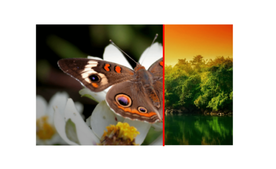
Image Comparison code: 1.index.html: <!DOCTYPE html> <html> <head> <meta charset="UTF-8"> <title>Image Comparison</title> <link rel="stylesheet" type="text/css" href="style.css"> </head> <body> <div class="container"> <div class="imageBox imageBefore"><img src="image1.jpg"></div> <div class="imageBox imageAfter"><img src="image3.jpg"></div> </div> </body> </html> 2.style.css: body { margin: 0; padding: 0; } .container { position: absolute; top: 50%; left: 50%; transform: translate(-50%,-50%); width: […]
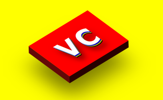
3D Logo Design code: 1.index.html: <!DOCTYPE html> <html> <head> <meta charset="UTF-8"> <title>3D Logo</title> <link rel="stylesheet" type="text/css" href="style.css"> </head> <body> <div class="logo"></div> </body> </html> 2.style.css: body { margin: 0; padding: 0; background: yellow; } .logo { position: absolute; top: 20%; left: 60%; width: 300px; height: 200px; background: url(logo.png); background-size: 100%; transform: […]