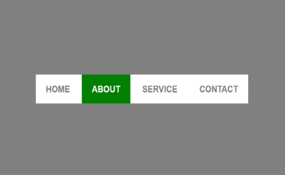
3D Menu Hover Effect Code: 1.index.html: <!DOCTYPE html> <html> <head> <meta charset="UTF-8"> <title>3D Menu Hover Effect</title> <link rel="stylesheet" type="text/css" href="style.css"> </head> <body> <ul> <li><a href="#"><span title="Home">Home</span></a></li> <li><a href="#"><span title="About">About</span></a></li> <li><a href="#"><span title="Service">Service</span></a></li> <li><a href="#"><span title="Contact">Contact</span></a></li> </ul> </body> </html> 2.style.css: body { margin: 0; padding: 0; background: gray; } ul { […]
Архивы по месяцам: Февраль 2022
30 записей
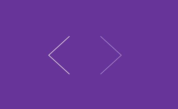
Arrow CSS code: 1.index.html: <!DOCTYPE html> <html> <head> <meta charset="UTF-8"> <title>Arrow CSS</title> <link rel="stylesheet" type="text/css" href="style.css"> </head> <body> <div class="left"></div> <div class="right"></div> </body> </html> 2.style.css: body { margin: 0; padding: 280px 0 0 500px; background: rebeccapurple; } .left, .right { width: 100px; height: 100px; transition: 0.5s; float: left; box-shadow: -2px […]
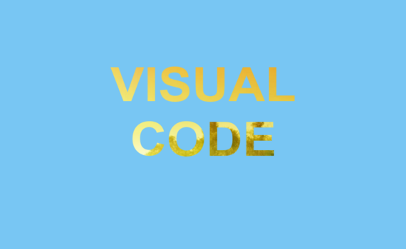
Text Clipping Mask code: 1.index.html: <!DOCTYPE html> <html> <head> <meta charset="UTF-8"> <title>Text Clipping Mask</title> <link rel="stylesheet" type="text/css" href="style.css"> </head> <body> <h1>visual<br>code</h1> </body> </html> 2.style.css: body { margin: 0; padding: 0; background: rgb(120,198,243); } h1 { font-family: Arial, Helvetica, sans-serif; font-weight: bold; font-size: 12em; text-align: center; margin: 250px auto; text-transform: uppercase; […]
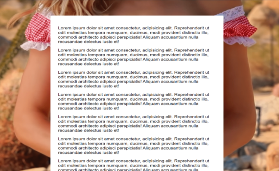
Full Background Image code: 1.index.html: <!DOCTYPE html> <html> <head> <meta charset="UTF-8"> <title>Full Background Image</title> <link rel="stylesheet" href="style.css"> </head> <body> <div class="content"> <p>Lorem ipsum dolor sit amet consectetur, adipisicing elit. Reprehenderit ut odit molestias tempora numquam, ducimus, modi provident distinctio illo, commodi architecto adipisci perspiciatis! Aliquam accusantium nulla recusandae delectus iusto […]
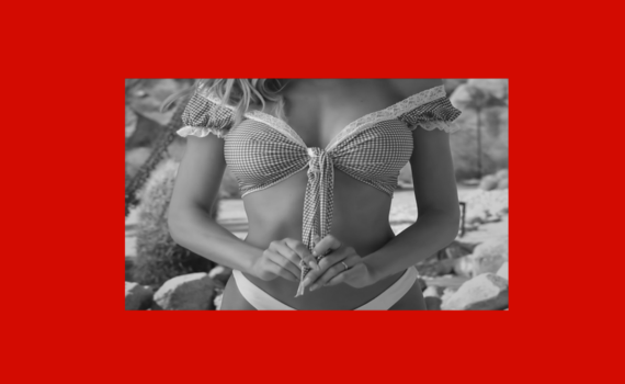
Grayscale Hover Effect code: 1.index.html: <!DOCTYPE html> <html> <head> <meta charset="UTF-8"> <title>Grayscale Hover Effect</title> <link rel="stylesheet" href="style.css"> </head> <body> <img src="image.jpg"> </body> </html> 2.style.css: body { margin: 0; padding: 0; background: rgb(211,11,1); } img { position: absolute; top: 50%; left: 50%; transform: translate(-50% , -50%); filter: grayscale(100%); transition: 0.5s ease-in-out; […]
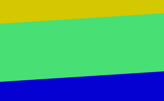
Skewed Background Using Border code: 1.index.html: <!DOCTYPE html> <html> <head> <meta charset="UTF-8"> <title>Skewed Background Using Border</title> <link rel="stylesheet" href="style.css"> </head> <body> <section class="sec1"></section> <section class="sec2"></section> <section class="sec3"></section> </body> </html> 2.style.css: body { margin: 0; padding: 0; } .sec1, .sec2, .sec3 { height: 400px; width: 100%; } .sec1 { background: rgb(211,200,1); […]
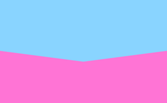
Skewed Background Tutorial code: 1.index.html: <!DOCTYPE html> <html> <head> <meta charset="UTF-8"> <title>Skewed Background</title> <link rel="stylesheet" href="style.css"> </head> <body> <section class="sec1"></section> <section class="sec2"></section> </body> </html> 2.style.css: body { margin: 0; padding: 0; } .sec1 { width: 100%; height: 500px; background: rgb(137,212,255); position: relative; } .sec2 { width: 100%; height: 500px; background: […]
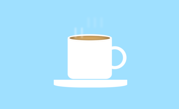
Animated cup with cappuccino code: 1.index.html: <!DOCTYPE html> <html> <head> <meta charset="UTF-8"> <title>Animated cup with cappuccino</title> <link rel="stylesheet" href="style.css"> </head> <body> <div class="cup"> <ul> <li></li> <li></li> <li></li> <li></li> <li></li> </ul> </div> <div class="plate"></div> </body> </html> 2.style.css: body { background: rgb(159,224,255); margin: 0; padding: 0; } .cup { position: absolute; top: […]
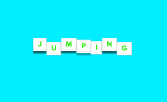
3D Jumping Text Effect code: 1.index.html: <!DOCTYPE html> <html> <head> <meta charset="UTF-8"> <title>3D Jumping Text Effect</title> <link rel="stylesheet" type="text/css" href="style.css"> </head> <body> <h1> <span>J</span> <span>U</span> <span>M</span> <span>P</span> <span>I</span> <span>N</span> <span>G</span> </h1> </body> </html> 2.style.css: body { margin: 0; padding: 0; background: rgb(0,238,255); } h1 { margin: 0; padding: 0; position: […]
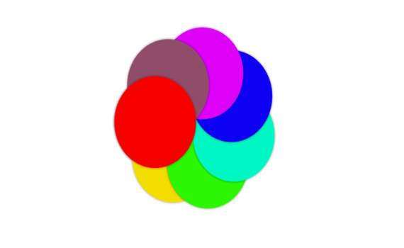
Animation Effects code: 1.index.html: <!DOCTYPE html> <html> <head> <meta charset="UTF-8"> <title>Animation Effects</title> <link rel="stylesheet" href="style.css"> </head> <body> <ul> <li></li> <li></li> <li></li> <li></li> <li></li> <li></li> <li></li> <li></li> </ul> </body> </html> 2.style.css: body { margin: 0; padding: 0; position: absolute; left: 40%; top: 20%; } ul li { list-style: none; width: 200px; […]