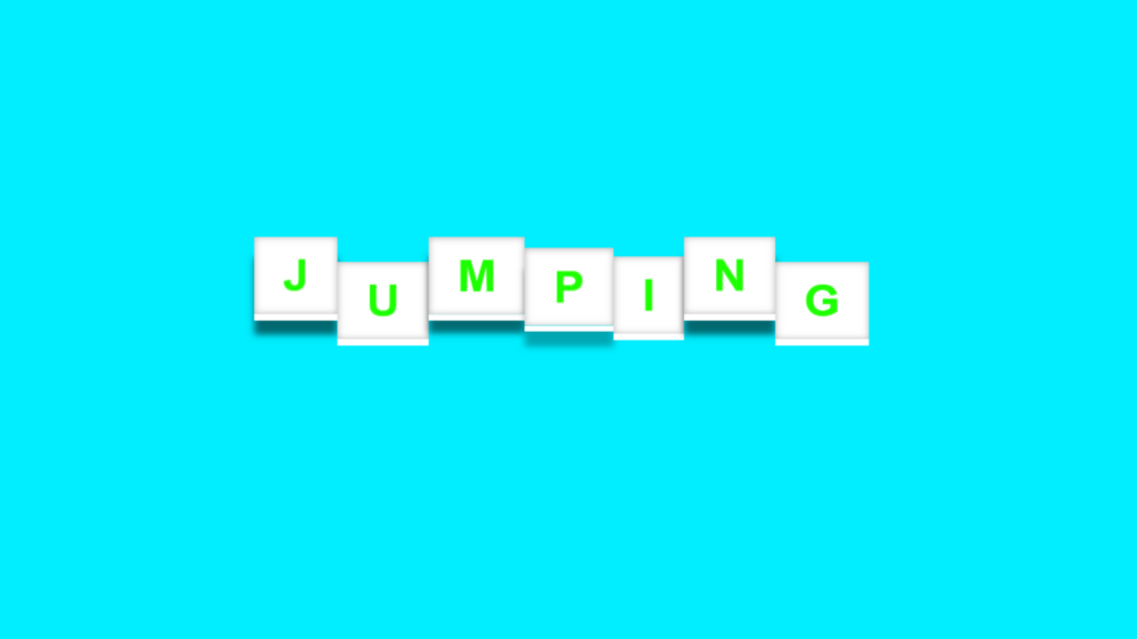
3D Jumping Text Effect code:
1.index.html:
<!DOCTYPE html> <html> <head> <meta charset="UTF-8"> <title>3D Jumping Text Effect</title> <link rel="stylesheet" type="text/css" href="style.css"> </head> <body> <h1> <span>J</span> <span>U</span> <span>M</span> <span>P</span> <span>I</span> <span>N</span> <span>G</span> </h1> </body> </html>
2.style.css:
body { margin: 0; padding: 0; background: rgb(0,238,255); } h1 { margin: 0; padding: 0; position: absolute; top: 50%; left: 50%; transform: translate(-50% , -50%); } h1 span { color: rgb(30,255,0); background: rgb(255,255,255); padding: 10px 20px; font-family: Arial, Helvetica, sans-serif; display: table-cell; box-shadow: inset 0 0 5px rgba(0,0,0,0.3) , 0 5px 0 rgb(255,255,255); animation: animate 0.5s infinite; } @keyframes animate { 0% { transform: translateY(0px); box-shadow: inset 0 0 5px rgba(0,0,0,0.3) , 0 5px 0 rgb(255,255,255) , 0 15px 5px rgba(0,0,0,0); } 50% { transform: translateY(-20px); box-shadow: inset 0 0 5px rgba(0,0,0,0.3) , 0 5px 0 rgb(255,255,255) , 0 15px 5px rgba(0,0,0,0.6); } 0% { transform: translateY(0px); box-shadow: inset 0 0 5px rgba(0,0,0,0.3) , 0 5px 0 rgb(255,255,255) , 0 15px 5px rgba(0,0,0,0); } } h1 span:nth-child(1) { animation-delay: 0.2s; } h1 span:nth-child(2) { animation-delay: 0.4s; } h1 span:nth-child(3) { animation-delay: 0.6s; } h1 span:nth-child(4) { animation-delay: 0.8s; } h1 span:nth-child(5) { animation-delay: 1s; } h1 span:nth-child(6) { animation-delay: 1.2s; } h1 span:nth-child(7) { animation-delay: 1.4s; }


