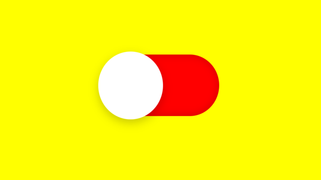
Custom Animated Checkbox code:
1.index.html:
<!DOCTYPE html> <html> <head> <meta charset="UTF-8"> <title>Custom Animated Checkbox</title> <link rel="stylesheet" type="text/css" href="style.css"> </head> <body> <div class="center"> <input type="checkbox" name=""> </div> </body> </html>
2.style.css:
body { margin: 0; padding: 0; background: yellow; } .center { position: absolute; top: 50%; left: 50%; transform: translate(-50%,-50%); } input[type="checkbox"] { position: relative; width: 80px; height: 40px; -webkit-appearance: none; background: red; outline: none; border-radius: 20px; box-shadow: inset 0 0 5px rgba(0,0,0,0.2); transition: 0.5s; } input:checked[type="checkbox"] { background: green; } input[type="checkbox"]::before { content: ''; position: absolute; width: 40px; height: 40px; border-radius: 20px; top: 0; left: 0; background: white; transform: scale(1.1); box-shadow: 0 2px 5px rgba(0,0,0,0.2); transition: 0.5s; } input:checked[type="checkbox"]::before { left: 40px; }

