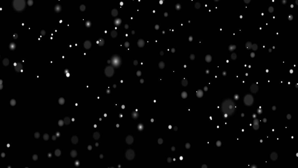
Background Particle Animation code:
1.index.html:
<!DOCTYPE html> <html> <head> <meta charset="UTF-8"> <title>Background Particle Animation</title> <link rel="stylesheet" type="text/css" href="style.css"> </head> <body> <div class="container"> <ul> <li></li> <li></li> <li></li> <li></li> <li></li> </ul> </div> </body> </html>
2.style.css:
body { margin: 0; padding: 0; } h1 { margin: 0; padding: 0; position: absolute; top: 50%; left: 50%; transform: translate(-50%,-50%); text-align: center; color: white; font-size: 6em; z-index: 2; } .container { position: relative; } ul { position: absolute; margin: 0; padding: 0; width: 100vw; height: 100vh; overflow: hidden; background: black; } li { position: absolute; top: 0; left: 0; list-style: none; width: 100%; height: 100%; background: url(snow.png); background-size: contain; animation: animate 10s linear infinite; } @keyframes animate { 0% { transform: scale(1) rotate(0deg); opacity: 0; } 50% { transform: scale(2) rotate(180deg); opacity: 1; } 100% { transform: scale(0) rotate(360deg); opacity: 0; } } ul li:nth-child(1) { animation-delay: 8s; } ul li:nth-child(2) { animation-delay: 6s; } ul li:nth-child(3) { animation-delay: 4s; } ul li:nth-child(4) { animation-delay: 2s; } ul li:nth-child(5) { animation-delay: 0s; }

