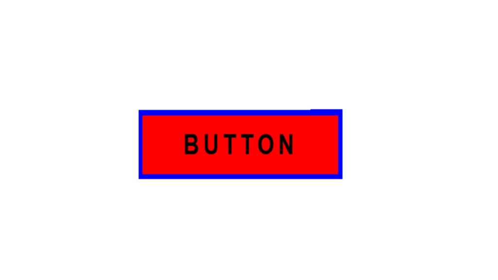
Super Button Hover Effect code:
1.index.html:
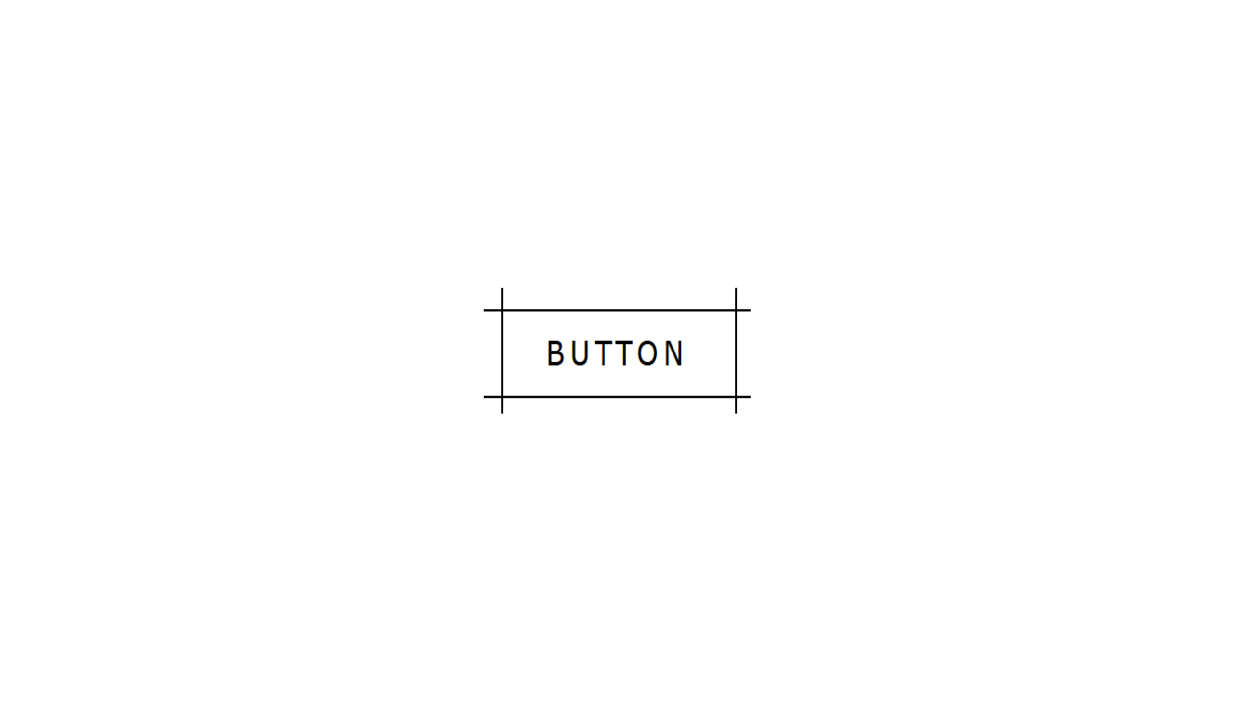
<!DOCTYPE html> <html> <head> <meta charset="UTF-8"> <title>Super Button Hover Effect</title> <link rel="stylesheet" href="style.css"> </head> <body> <a href="#"> <div class="box"> <div class="inner_box"><h4>BUTTON</h4></div> </div> </a> </body> </html>
2.style.css:
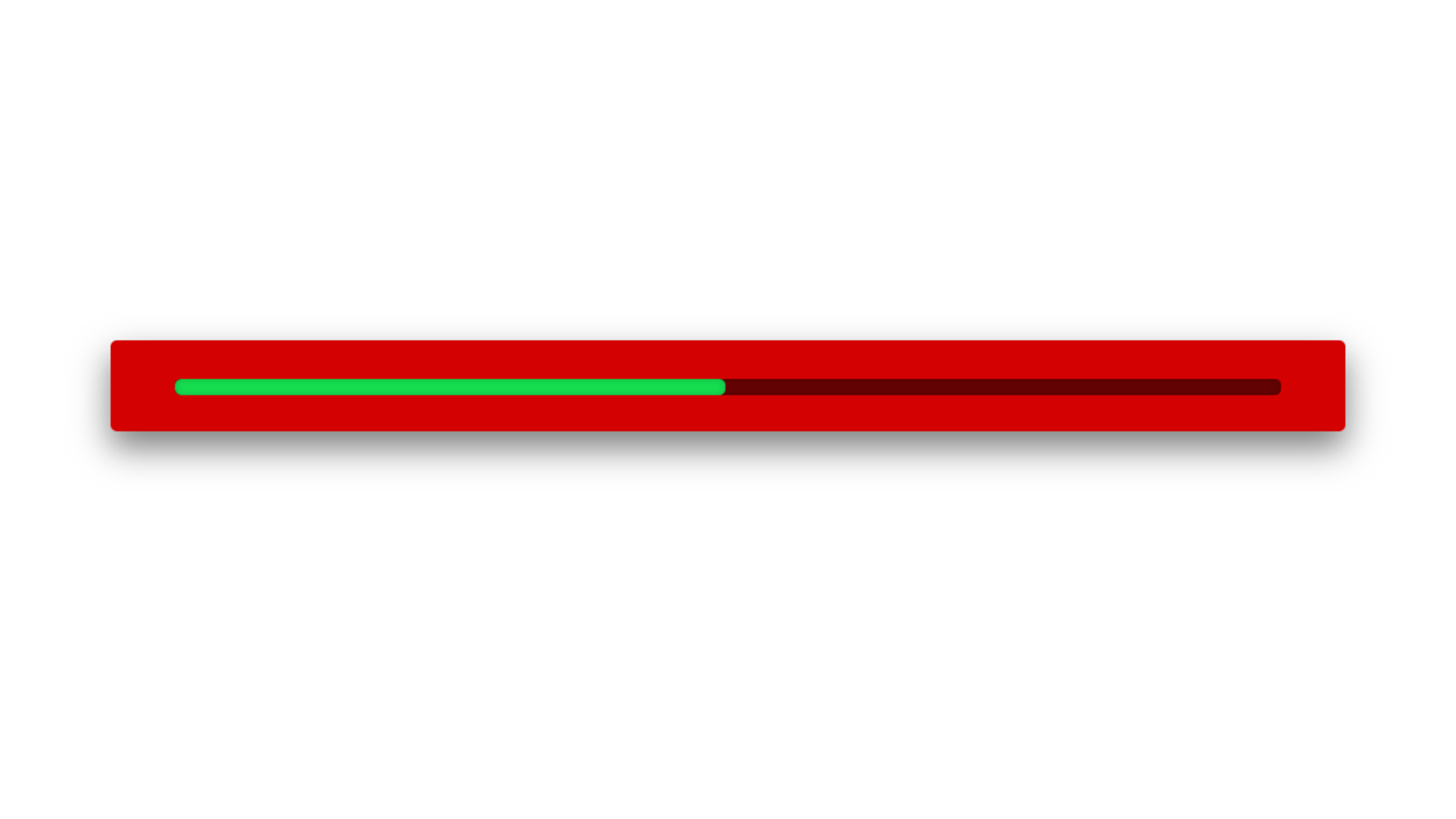
body { margin: 0; padding: 0; font-family: Arial, Helvetica, sans-serif; } .box { position: absolute; top: 50%; left: 50%; transform: translate(-50%, -50%); width: 150px; height: 40px; background: red; box-sizing: border-box; padding: 3px; } .inner_box { position: relative; width: 100%; height: 100%; background: green; overflow: hidden; } .box::before { content: ''; position: absolute; top: 0; left: -50%; width: 50%; height: 100%; background: blue; transition: 0.5s; } .box::after { content: ''; position: absolute; top: 0; right: -50%; width: 50%; height: 100%; background: blue; transition: 0.5s; z-index: 10; } .inner_box::before { content: ''; position: absolute; top: 0; left: -50%; width: 50%; height: 100%; background: red; transition: 0.5s; } .inner_box::after { content: ''; position: absolute; top: 0; right: -50%; width: 50%; height: 100%; background: red; transition: 0.5s; z-index: 11; } .box:hover::before { left: 0; } .box:hover::after { right: 0; } .box:hover .inner_box::before { left: 0; } .box:hover .inner_box::after { right: 0; } h4 { position: absolute; top: 50%; left: 50%; transform: translate(-50%, -50%); text-align: center; color: gold; z-index: 100; margin: 0; padding: 0; letter-spacing: 3px; transition: 0.5s; } .box:hover h4 { color: black; }
