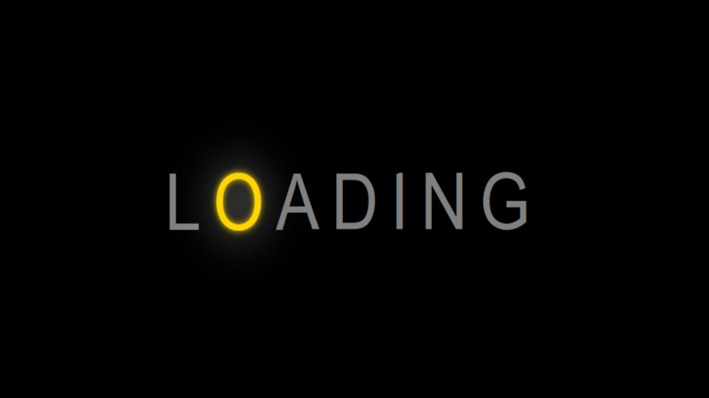
Glowing Text Animation code:
1.index.html:
<!DOCTYPE html> <html> <head> <meta charset="UTF-8"> <title>Glowing Text Animation</title> <link rel="stylesheet" type="text/css" href="style.css"> </head> <body> <ul> <li>L</li> <li>O</li> <li>A</li> <li>D</li> <li>I</li> <li>N</li> <li>G</li> </ul> </body> </html>
2.style.css:
body { margin: 0; padding: 0; background: black; } ul { position: absolute; top: 50%; left: 50%; transform: translate(-50% , -50%); margin: 0; padding: 0; display: flex; } ul li { list-style: none; color: gray; font-family: Arial, Helvetica, sans-serif; font-size: 5em; letter-spacing: 15px; animation: animate 1.4s linear infinite; } @keyframes animate { 0% { color: gray; text-shadow: none; } 90% { color: gray; text-shadow: none; } 100% { color: gold; text-shadow: 0 0 7px gold , 0 0 50px white; } } ul li:nth-child(1) { animation-delay: 0.2s; } ul li:nth-child(2) { animation-delay: 0.4s; } ul li:nth-child(3) { animation-delay: 0.6s; } ul li:nth-child(4) { animation-delay: 0.8s; } ul li:nth-child(5) { animation-delay: 1s; } ul li:nth-child(6) { animation-delay: 1.2s; } ul li:nth-child(7) { animation-delay: 1.4s; }

