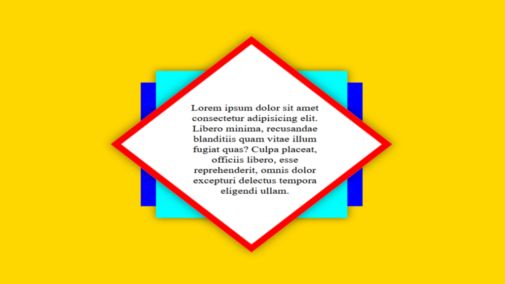
Div Shape Hover Effect code:
1.index.html:
<!DOCTYPE html> <html> <head> <meta charset="UTF-8"> <title>Div Shape</title> <link rel="stylesheet" type="text/css" href="style.css"> </head> <body> <div class="container"> <div class="shape"> <p>Lorem ipsum dolor sit amet consectetur adipisicing elit. Libero minima, recusandae blanditiis quam vitae illum fugiat quas? Culpa placeat, officiis libero, esse reprehenderit, omnis dolor excepturi delectus tempora eligendi ullam.</p> </div> </div> </body> </html>
2.style.css:
body { margin: 0; padding: 0; background: gold; } .container { width: 300px; height: 300px; position: absolute; top: 50%; left: 50%; transform: translate(-50%,-50%); background: transparent; border: 10px solid transparent; padding: 10px; box-sizing: border-box; transition: 0.5s; box-shadow: none; } .shape { background: white; width: 100%; height: 100%; box-sizing: border-box; transform: rotate(45deg) scale(1.2); border: 10px solid red; border-radius: 50%; transition: 0.5s; box-shadow: 0 0 15px rgba(0,0,0,0.5); } .shape p { padding: 25px; margin: 0; text-align: center; box-sizing: border-box; transform: rotate(-45deg) translate(-7px,20px); font-size: 15px; } .container::before { content: ''; position: absolute; width: 24px; height: 90%; background: blue; left: 50px; top: 5%; transition: 0.5s; opacity: 0; animation-delay: 0.4s; z-index: -1; } .container::after { content: ''; position: absolute; width: 24px; height: 90%; background: blue; right: 50px; top: 5%; transition: 0.5s; opacity: 0; animation-delay: 0.4s; z-index: -1; } .container:hover::before { left: -34px; opacity: 1; } .container:hover::after { right: -34px; opacity: 1; } .container:hover .shape { border-radius: 0; } .container:hover { background: aqua; border: 10px solid transparent; box-shadow: 0 0 15px rgba(0,0,0,0.5) }

