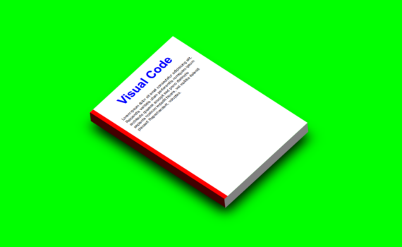
3D Mockup code: 1.index.html: <!DOCTYPE html> <html> <head> <meta charset="UTF-8"> <title>3D Mockup</title> <link rel="stylesheet" href="style.css"> </head> <body> <div class="center"> <div class="page"> <h1>Visual Code</h1> <p>Lorem ipsum dolor sit amet consectetur adipisicing elit. Reiciendis veritatis ullam perferendis numquam ipsum architecto quaerat suscipit sed porro distinctio sapiente nostrum impedit facere, vel mollitia deleniti […]
Архивы по месяцам: Апрель 2022
17 записей
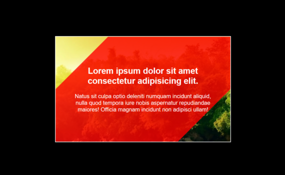
Image Hover Effect code: 1.index.html: <!DOCTYPE html> <html> <head> <meta charset="UTF-8"> <title>Image Hover Effect</title> <link rel="stylesheet" href="style.css"> </head> <body> <div class="center"> <div class="imgBox"> <img src="image1.jpg"> <div class="container"> <div class="content"> <h1>Lorem ipsum dolor sit amet consectetur adipisicing elit.</h1> <p>Natus sit culpa optio deleniti numquam incidunt aliquid, nulla quod tempora iure nobis […]
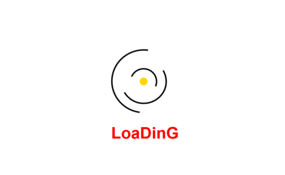
Spinning Loader Animation code: 1.index.html: <!DOCTYPE html> <html> <head> <meta charset="UTF-8"> <title>Loader Animation</title> <link rel="stylesheet" href="style.css"> </head> <body> <div class="center"> <div class="large"> <div class="medium"> <div class="small"> <div class="dot"></div> </div> </div> </div> <h1>LoaDinG</h1> </div> </body> </html> 2.style.css: body { margin: 0; padding: 0; } .center { position: absolute; top: 50%; left: […]
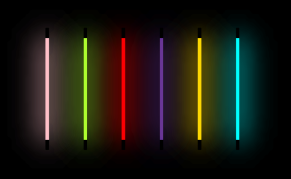
Neon Lights code: 1.index.html: <!DOCTYPE html> <html> <head> <meta charset="UTF-8"> <title>Neon Lights</title> <link rel="stylesheet" href="style.css"> </head> <body> <ul> <li></li> <li></li> <li></li> <li></li> <li></li> <li></li> </ul> </body> </html> 2.style.css: body { margin: 0; padding: 0; background: black; } ul { position: absolute; top: 50%; left: 50%; transform: translate(-50%,-50%); margin: 0; padding: […]
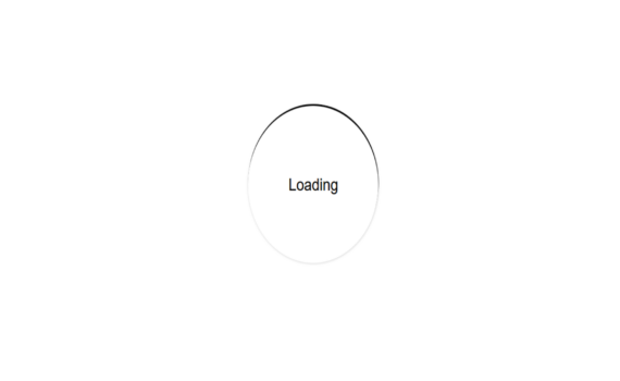
Animated Loader Ring code: 1.index.html: <!DOCTYPE html> <html> <head> <meta charset="UTF-8"> <title>Animated Loader Ring</title> <link rel="stylesheet" href="style.css"> </head> <body> <div class="center"> <div class="text">Loading</div> <div class="ring"></div> </div> </body> </html> 2.style.css: body { margin: 0; padding: 0; font-family: Arial, Helvetica, sans-serif; } .center { position: absolute; top: 50%; left: 50%; transform: translate(-50%,-50%); […]
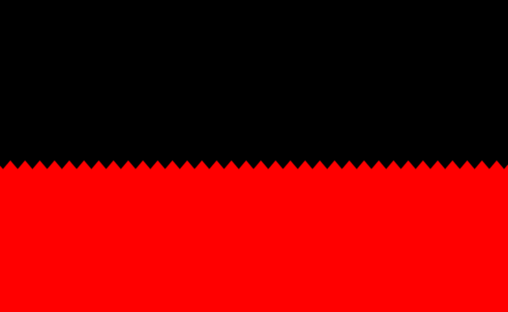
Zig Zag Gradient Effects code: 1.index.html: <!DOCTYPE html> <html> <head> <meta charset="UTF-8"> <title>Zig Zag</title> <link rel="stylesheet" href="style.css"> </head> <body> <div class="zigzag"></div> </body> </html> 2.style.css: body { margin: 0; padding: 0; background: black; } .zigzag { position: absolute; top: 50%; width: 100%; height: 50%; background: red; } .zigzag::before { content: ''; […]
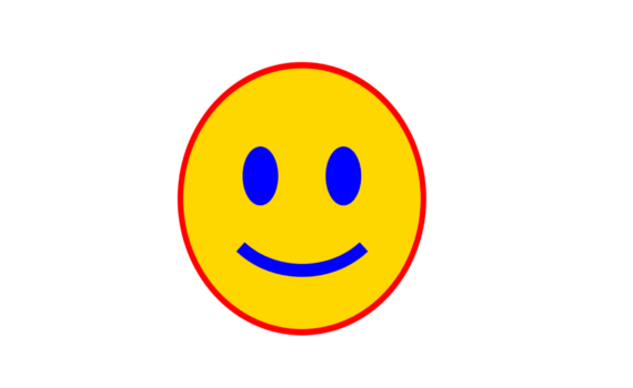
Smily Eyes and Lips code: 1.index.html: <!DOCTYPE html> <html> <head> <meta charset="UTF-8"> <title>Smily Eyes and Lips</title> <link rel="stylesheet" href="style.css"> </head> <body> <div class="smily"> <div class="eyes"></div> <div class="lips"></div> </div> </body> </html> 2.style.css: body { margin: 0; padding: 0; } .smily { position: absolute; top: 50%; left: 50%; transform: translate(-50%,-50%); width: 200px; […]