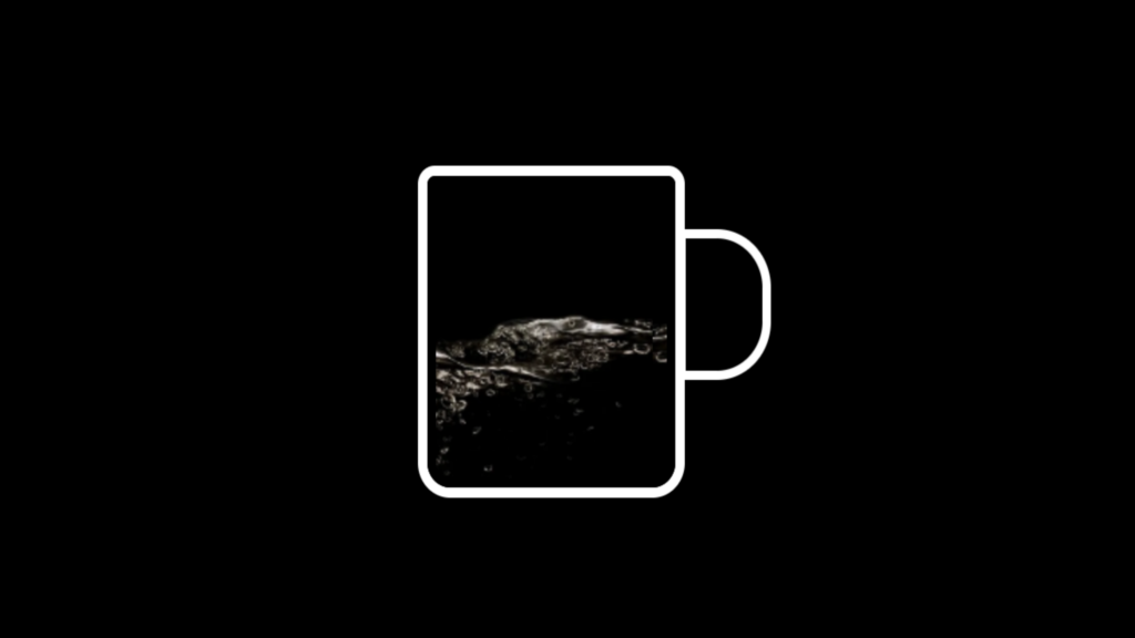
Loading Page Animation code:
1.index.html:
<!DOCTYPE html> <html> <head> <meta charset="UTF-8"> <title>Loading Page Animation</title> <link rel="stylesheet" href="style.css"> <body> <div class="cup"></div> </body> </html>
2.style.css:
body { margin: 0; padding: 0; background: black; } .cup { position: absolute; top: 50%; left: 50%; transform: translate(-50%,-50%); width: 150px; height: 180px; border: 6px solid black; border-top: 2px solid transparent; border-radius: 15px; border-top-left-radius: 5px; border-top-right-radius: 5px; background: url(777.png); background-repeat: repeat-x; animation: animate 10s linear infinite; box-shadow: 0 0 0 6px white, 0 20px 35px rgba(0,0,0,1); } .cup::before { content: ''; position: absolute; width: 50px; height: 80px; border: 6px solid white; right: -68px; top: 30px; border-top-right-radius: 35px; border-bottom-right-radius: 35px; } @keyframes animate { 0% { background-position: 0 100px; } 10% { background-position: 0 100px; } 40% { background-position: 1000px -70px; } 80% { background-position: 2000px -70px; } 100% { background-position: 2500px 100px; } }