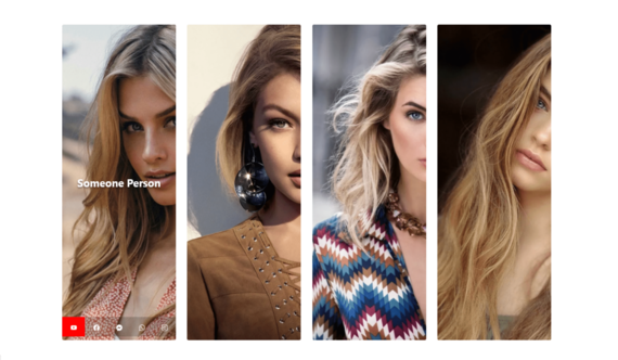
Responsive 4 Boxes Card UI Design Code: 1.index.html: <!DOCTYPE html> <html> <head> <title>Responsive 4 Boxes Card UI Design</title> <meta name="viewport" content="width=device-width, initial-scale=1, user-scalable=no"/> <link rel="stylesheet" type="text/css" href="style.css"> <link rel="stylesheet" href="https://cdn.jsdelivr.net/npm/@fortawesome/fontawesome-free@6.1.2/css/fontawesome.min.css"> <link rel="stylesheet" href="https://cdn.jsdelivr.net/npm/bootstrap@5.2.0/dist/css/bootstrap.min.css"> </head> <body> <section> <div class="container-fluid"> <div class="container"> <div class="row"> <div class="col-lg-3 col-md-3 col-sm-6 col-xs-12"> <div class="imageBox"> <img […]
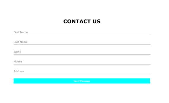
Contact Us Form Hover Effect Code: 1.index.html: <!DOCTYPE html> <html> <head> <title>Contact Us Form Hover Effect</title> <link rel="stylesheet" type="text/css" href="style.css"> <link rel="stylesheet" href="https://cdn.jsdelivr.net/npm/@fortawesome/fontawesome-free@6.1.2/css/fontawesome.min.css"> </head> <body> <section> <div class="container-fluid"> <div class="container"> <div class="formBox"> <form> <div class="row"> <div class="col-7"> <h1>Contact Us</h1> </div> <div class="row"> <div class="col-4"> <div class="inputBox"> <div class="inputText">First Name</div> <input […]
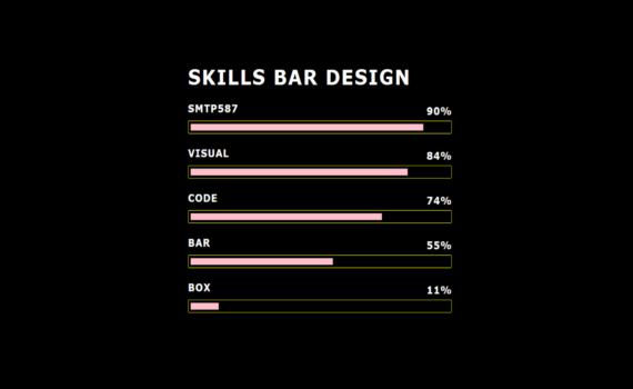
Skills Bar Design Code: 1.index.html: <!DOCTYPE html> <html> <head> <meta name="viewport" content="width=device-width, initial-scale=1, user-scalable=no"/> <title>Skills Bar Design</title> <link rel="stylesheet" type="text/css" href="style.css"> </head> <body> <div class="center"> <h1>Skills Bar Design</h1> <div class="skillBox"> <p>Smtp587</p> <p>90%</p> <div class="skill"> <div class="skill_level" style="width: 90%"></div> </div> </div> <div class="skillBox"> <p>Visual</p> <p>84%</p> <div class="skill"> <div class="skill_level" style="width: 84%"></div> […]
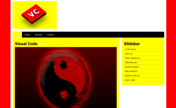
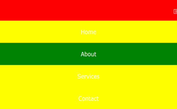
Simple Responsive Website Code: 1.index.html: <!DOCTYPE html> <html> <head> <meta name="viewport" content="width=device-width, initial-scale=1, user-scalable=no"/> <title>Simple Responsive Website</title> <link rel="stylesheet" type="text/css" href="style.css"> </head> <body> <div class="container"> <div class="full-width"> <img src="1.png"> </div> <nav> <ul> <li><a href="#" class="active">Home</a></li> <li><a href="#">About</a></li> <li><a href="#">Services</a></li> <li><a href="#">Contact</a></li> </ul> </nav> <div class="full-width margin-top"> <div class="col-7"> <div class="post"> […]
Responsive Menu Code: 1.index.html: <!DOCTYPE html> <html> <head> <meta name="viewport" content="width=device-width, initial-scale=1, user-scalable=no"/> <title>Responsive Menu</title> <link rel="stylesheet" type="text/css" href="style.css"> <link rel="stylesheet" href="https://cdn.jsdelivr.net/npm/@fortawesome/fontawesome-free@6.1.2/css/fontawesome.min.css"> </head> <body> <nav> <div class="toggle"> <svg xmlns="http://www.w3.org/2000/svg" width="16" height="16" fill="currentColor" class="bi bi-card-list menu" viewBox="0 0 16 16"> <path d="M14.5 3a.5.5 0 0 1 .5.5v9a.5.5 0 0 1-.5.5h-13a.5.5 0 […]
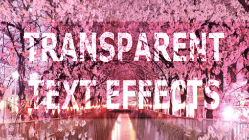
Transparent Text Effects Code: 1.index.html: <!DOCTYPE html> <html> <head> <meta charset="UTF-8"> <title>Transparent Text Effects</title> <link rel="stylesheet" type="text/css" href="style.css"> <body> <div class="box"> <h1>Transparent Text Effects</h1> </div> </body> </html> 2.style.css: body { margin: 0; padding: 0; font-family: Verdana, Geneva, Tahoma, sans-serif; } .box { height: 100vh; background: url(6.png); background-size: cover; background-repeat: no-repeat; […]
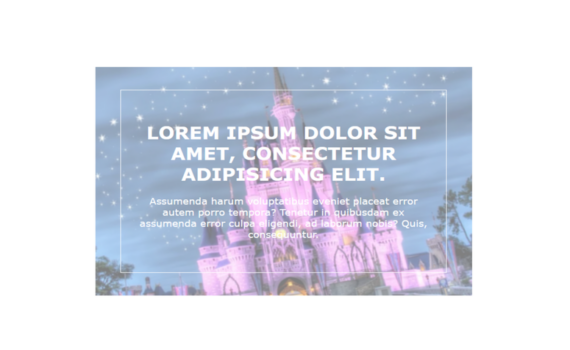
Image Hover Effect With Caption Overlay Code: 1.index.html: <!DOCTYPE html> <html> <head> <meta charset="UTF-8"> <title>Image Hover Effect</title> <link rel="stylesheet" type="text/css" href="style.css"> <body> <div class="box"> <div class="figure"> <img src="5.png"> <div class="caption"> <div class="about"> <h2>Lorem ipsum dolor sit amet, consectetur adipisicing elit.</h2> <p>Assumenda harum voluptatibus eveniet placeat error autem porro tempora? Tenetur […]
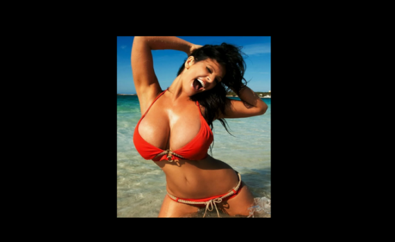
Image Zoom on Mouse Hover Code: 1.index.html: <!DOCTYPE html> <html> <head> <meta charset="UTF-8"> <title>Image Zoom on Mouse Hover</title> <link rel="stylesheet" type="text/css" href="style.css"> <body> <div class="box"> <img src="7.png"> </div> </body> </html> 2.style.css: body { margin: 0; padding: 0; background: black; } .box { position: absolute; top: 50%; left: 50%; transform: translate(-50%,-50%); […]
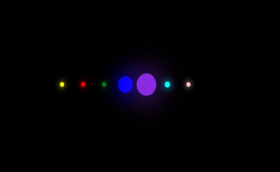
Loading Bar Animation Code: 1.index.html: <!DOCTYPE html> <html> <head> <meta charset="UTF-8"> <title>Loading Bar Animation</title> <link rel="stylesheet" type="text/css" href="style.css"> <body> <ul> <li></li> <li></li> <li></li> <li></li> <li></li> <li></li> <li></li> </ul> </body> </html> 2.style.css: body { margin: 0; padding: 0; background: black; } ul { position: absolute; top: 50%; left: 50%; transform: translate(-50%,-50%); […]
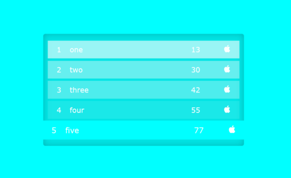
List Style Code: 1.index.html: <!DOCTYPE html> <html> <head> <meta charset="UTF-8"> <title>List Style</title> <link rel="stylesheet" type="text/css" href="style.css"> <link rel="stylesheet" href="https://cdn.jsdelivr.net/npm/@fortawesome/fontawesome-free@6.1.2/css/fontawesome.min.css"> <body> <ul> <li> <span class="number">1</span> <span class="name">one</span> <span class="points">13</span> <span class="badge"><svg xmlns="http://www.w3.org/2000/svg" width="16" height="16" fill="currentColor" class="bi bi-apple" viewBox="0 0 16 16"> <path d="M11.182.008C11.148-.03 9.923.023 8.857 1.18c-1.066 1.156-.902 2.482-.878 2.516.024.034 1.52.087 2.475-1.258.955-1.345.762-2.391.728-2.43Zm3.314 […]