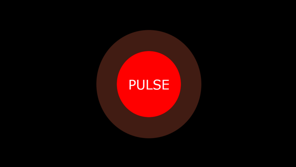
Pulse Animation code:
1.index.html:
<!DOCTYPE html> <html> <head> <meta charset="UTF-8"> <title>Pulse Animation</title> <link rel="stylesheet" href="style.css"> </head> <body> <div class="center"> <div class="pulse">pulse</div> </div> </body> </html>
2.style.css:
body { margin: 0; padding: 0; background: black; } .center { position: absolute; top: 50%; left: 50%; transform: translate(-50%,-50%); } .pulse { width: 100px; height: 100px; background: red; border-radius: 50%; color: white; font-size: 20px; text-align: center; line-height: 100px; font-family: Verdana, Geneva, Tahoma, sans-serif; text-transform: uppercase; animation: animate 3s linear infinite; } @keyframes animate { 0% { box-shadow: 0 0 0 0 rgba(255,109,74,0.7), 0 0 0 0 rgba(255,109,74,0.7); } 40% { box-shadow: 0 0 0 50px rgba(255,109,74,0), 0 0 0 0 rgba(255,109,74,0.7); } 80% { box-shadow: 0 0 0 50px rgba(255,109,74,0), 0 0 0 30px rgba(255,109,74,0); } 100% { box-shadow: 0 0 0 0 rgba(255,109,74,0.7), 0 0 0 30px rgba(255,109,74,0); } }

