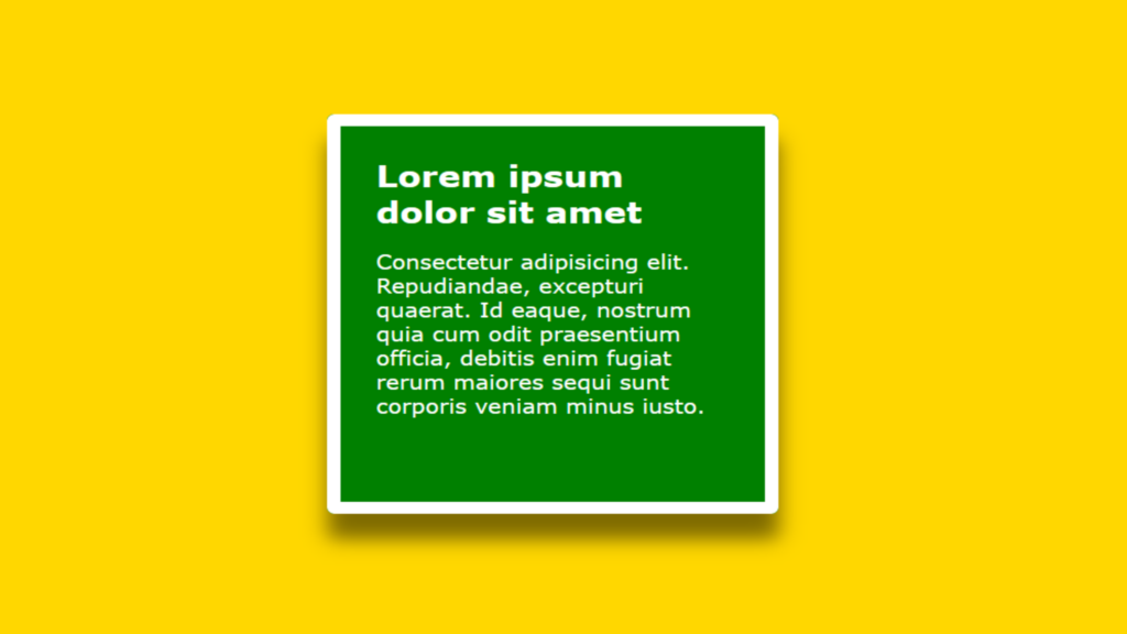
Div Hover Effect code:
1.index.html:
<!DOCTYPE html> <html> <head> <meta charset="UTF-8"> <title>Div Hover Effect</title> <link rel="stylesheet" href="style.css"> </head> <body> <div class="center"> <div class="box"> <h1>Lorem ipsum dolor sit amet</h1> <p>Consectetur adipisicing elit. Repudiandae, excepturi quaerat. Id eaque, nostrum quia cum odit praesentium officia, debitis enim fugiat rerum maiores sequi sunt corporis veniam minus iusto.</p> </div> </div> </body> </html>
2.style.css:
body { margin: 0; padding: 0; background: gold; font-family: Verdana, Geneva, Tahoma, sans-serif; } .center { position: absolute; top: 50%; left: 50%; transform: translate(-50%,-50%); } .box { width: 250px; height: 250px; padding: 25px; z-index: 1; background: transparent; overflow: hidden; border: 1px solid rgba(0,0,0,0.2); border-radius: 5px; transition: 0.5s; } .box h1 { margin: 0; padding: 0; font-size: 24px; transition: 0.5s; } .box p { transition: 0.5s; } .box::before { content: ''; position: absolute; top: 50%; left: 50%; transform: translate(-50%,-50%); width: 0; height: 0; background: green; z-index: -1; border-radius: 5px; transition: 0.5s; } .box:hover::before { width: 100%; height: 100%; } .box:hover h1, .box:hover p { color: white; } .box:hover { transition-delay: 0.5s; border: 10px solid white; box-shadow: 0 20px 15px rgba(0,0,0,0.5); }

