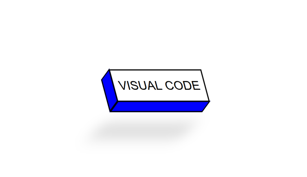
3D Skewed Button code:
1.index.html:
<!DOCTYPE html> <html> <head> <meta charset="UTF-8"> <title>3D Skewed Button</title> <link rel="stylesheet" href="style.css"> </head> <body> <div class="center"> <a href="#"><span></span><span></span>Visual Code</a> </div> </body> </html>
2.style.css:
body { margin: 0; padding: 0; font-family: Arial, Helvetica, sans-serif; } .center { position: absolute; top: 50%; left: 50%; transform: translate(-50%,-50%); } .center a { display: inherit; width: 150px; height: 50px; color: black; font-size: 20px; background: transparent; text-align: center; line-height: 50px; text-decoration: none; text-transform: uppercase; border: 2px solid black; transition: 0.5s; transform: skew(15deg); } .center a:hover { background: blue; color: white; } span:nth-child(1) { position: absolute; width: 15px; height: 100%; border: 2px solid black; background: blue; top: 6px; left: -19px; transform: skewY(-45deg); } span:nth-child(2) { position: absolute; width: 100%; height: 15px; border: 2px solid black; background: blue; bottom: -19px; right: 6px; transform: skewX(-45deg); box-shadow: 0 40px 25px rgba(0,0,0,0.2); }


