
Image Hover Effect With Caption Overlay Code:
1.index.html:
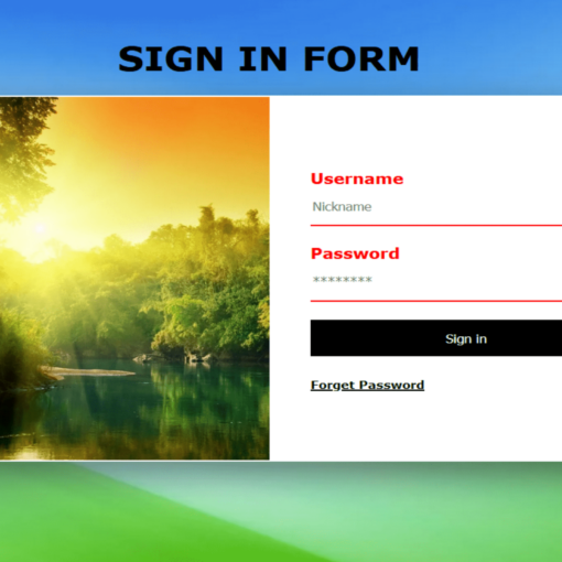
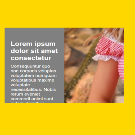
<!DOCTYPE html> <html> <head> <meta charset="UTF-8"> <title>Image Hover Effect</title> <link rel="stylesheet" type="text/css" href="style.css"> <body> <div class="box"> <div class="figure"> <img src="5.png"> <div class="caption"> <div class="about"> <h2>Lorem ipsum dolor sit amet, consectetur adipisicing elit.</h2> <p>Assumenda harum voluptatibus eveniet placeat error autem porro tempora? Tenetur in quibusdam ex assumenda error culpa eligendi, ad laborum nobis? Quis, consequuntur.</p> </div> </div> </div> </div> </body> </html>
2.style.css:
body { margin: 0; padding: 0; font-family: Verdana, Geneva, Tahoma, sans-serif; } .box { position: absolute; top: 50%; left: 50%; transform: translate(-50%,-50%); width: 600px; height: 400px; background: white; overflow: hidden; } .figure { width: 100%; height: 100%; } .figure img { width: 100%; transition: 0.5s; } .box:hover .figure img { transform: rotate(-10deg) scale(1.3); opacity: 0.5; } .caption { position: absolute; top: 40px; left: 40px; right: 40px; bottom: 40px; } .about { position: absolute; top: 50%; transform: translateY(-50%); z-index: 1; padding: 20px; text-align: center; opacity: 0; transition: 0.5s; } .box:hover .about { opacity: 1; } .about h2 { color: white; margin: 0; padding: 0; font-size: 30px; text-transform: uppercase; } .about p { color: white; margin: 20px 0 0 ; padding: 0; font-size: 16px; } .caption::before { content: ''; position: absolute; top: 0; left: 0; width: 100%; height: 100%; border-top: 1px solid white; border-bottom: 1px solid white; box-sizing: border-box; transition: 0.5s; transform: scale(0,1); } .box:hover .caption::before { transform: scale(1,1); } .caption::after { content: ''; position: absolute; top: 0; left: 0; width: 100%; height: 100%; border-left: 1px solid white; border-right: 1px solid white; box-sizing: border-box; transition: 0.5s; transform: scale(1,0); } .box:hover .caption::after { transform: scale(1,1); }
