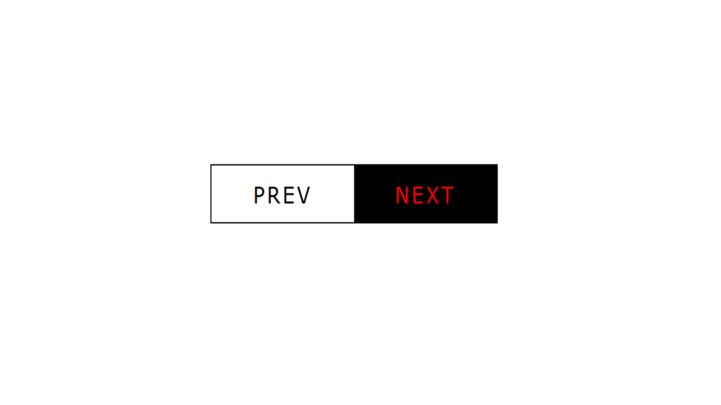
Button Hover Effect code:
1.index.html:
<!DOCTYPE html> <html> <head> <meta charset="UTF-8"> <title>Button Hover Effect</title> <link rel="stylesheet" href="style.css"> </head> <body> <ul> <li><a href="#">Prev</a></li> <li><a href="#">Next</a></li> </ul> </body> </html>
2.style.css:
body body { margin: 0; padding: 0; } ul { position: absolute; top: 50%; left: 50%; transform: translate(-50%,-50%); display: flex; margin: 0; padding: 0; border: 1px solid black; } ul li { list-style: none; } ul li a { position: relative; display: block; width: 120px; height: 40px; text-align: center; line-height: 40px; color: black; text-transform: uppercase; text-decoration: none; font-family: Verdana, Geneva, Tahoma, sans-serif; letter-spacing: 2px; overflow: hidden; transition: 0.5s; } ul li a:hover { color: red; } ul li a::before { content: ''; position: absolute; top: 0; width: 100%; height: 100%; background: black; z-index: -1; transition: 0.5s; } ul li:nth-child(odd) a::before { right: -100%; } ul li:nth-child(even) a::before { left: -100%; } ul li:nth-child(odd) a:hover:before { right: 0; } ul li:nth-child(even) a:hover:before { left: 0; }


