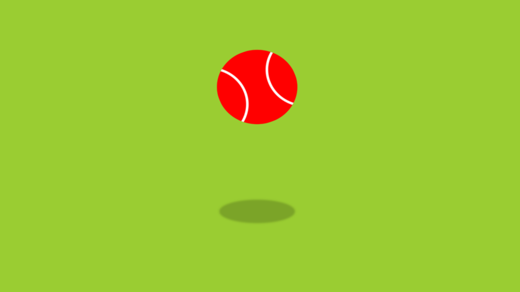
Animated Tennis Ball code:
1.index.html:
<!DOCTYPE html> <html> <head> <meta charset="UTF-8"> <title>Animated Tennis Ball</title> <link rel="stylesheet" href="style.css"> </head> <body> <div class="center"> <div class="ball"></div> <div class="shadow"></div> </div> </body> </html>
2.style.css:
body { margin: 0; padding: 0; background: yellowgreen; } .center { position: absolute; top: 50%; left: 50%; transform: translate(-50%,-50%); } .ball { position: absolute; width: 150px; height: 150px; background: red; border-radius: 50%; transform: translate(-50%,-50%); overflow: hidden; animation: animate 1.5s linear infinite; } .ball::before { content: ''; position: absolute; width: 100%; height: 100%; border-radius: 50%; box-sizing: border-box; background: transparent; border: 5px solid white; left: -65%; filter: blur(1); } .ball::after { content: ''; position: absolute; width: 100%; height: 100%; border-radius: 50%; box-sizing: border-box; background: transparent; border: 5px solid white; right: -65%; filter: blur(1); } @keyframes animate { 0% { transform: translate(-50%,-50%) translateY(-200px) rotate(0deg); } 50% { transform: translate(-50%,-50%) translateY(0px) rotate(180deg); } 100% { transform: translate(-50%,-50%) translateY(-200px) rotate(360deg); } } .shadow { position: absolute; width: 150px; height: 50px; transform: translate(-50%,100%); background: rgba(0,0,0,0.2); border-radius: 50%; z-index: -1; filter: blur(2px); animation: shadow 1.5s linear infinite; } @keyframes shadow { 0% { transform: translate(-50%,100%) scale(1); } 50% { transform: translate(-50%,100%) scale(0.5); } 100% { transform: translate(-50%,100%) scale(1); } }

