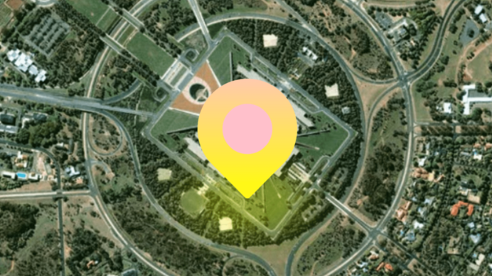
Glowing Map Pointer Code:
1.index.html:
<!DOCTYPE html> <html> <head> <meta charset="UTF-8"> <title>Glowing Map Pointer</title> <link rel="stylesheet" href="style.css"> </head> <body> <div class="center"> <div class="pointer"></div> <div class="shadow"></div> </div> </body> </html>
2.style.css:
body { margin: 0; padding: 0; background: url(map.png); background-size: cover; } .center { position: absolute; top: 50%; left: 50%; transform: translate(-50%,-50%); } .pointer { width: 50px; height: 50px; background: -webkit-linear-gradient(left top, pink, yellow); border-radius: 50%; border-bottom-right-radius: 2px; z-index: 2; transform: rotate(45deg); } .pointer::before { content: ''; position: absolute; width: 100%; height: 100%; background: pink; border-radius: 50%; transform: scale(0.5); } .shadow { position: absolute; bottom: -15px; left: 0; width: 50px; height: 10px; background: yellow; border-radius: 50%; z-index: -1; filter: blur(10px); animation: animate 1s linear infinite; } @keyframes animate { 0% { transform: scale(1.5); } 50% { transform: scale(0.5); } 100% { transform: scale(1.5); } }
