Loading Bar Animation Code:
1.index.html:
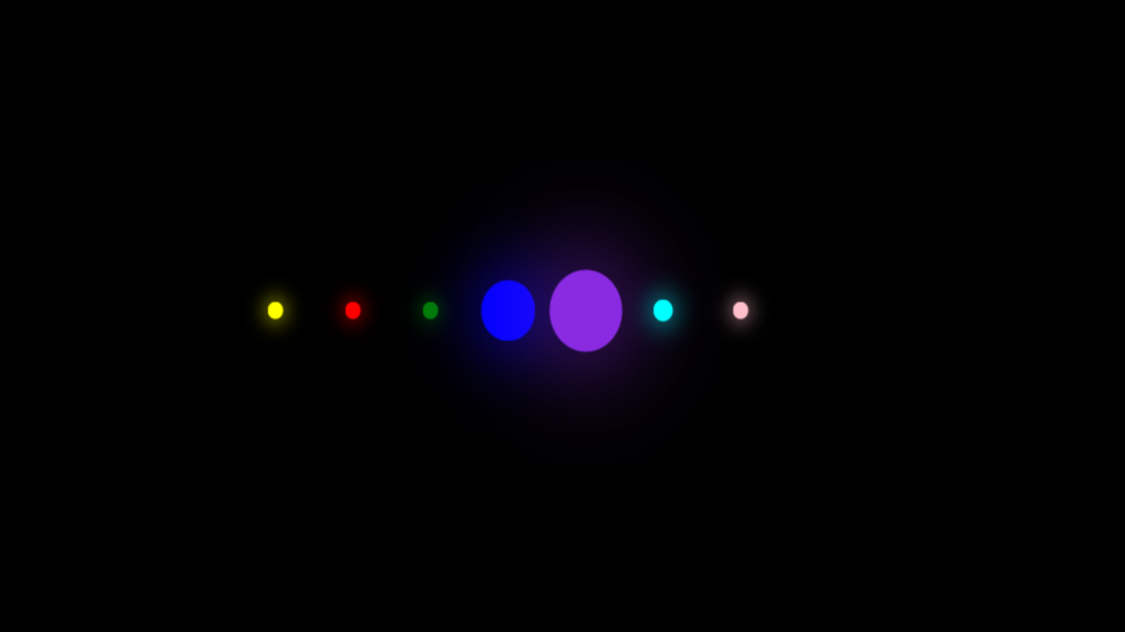
<!DOCTYPE html> <html> <head> <meta charset="UTF-8"> <title>Loading Bar Animation</title> <link rel="stylesheet" type="text/css" href="style.css"> <body> <ul> <li></li> <li></li> <li></li> <li></li> <li></li> <li></li> <li></li> </ul> </body> </html>
2.style.css:
body { margin: 0; padding: 0; background: black; } ul { position: absolute; top: 50%; left: 50%; transform: translate(-50%,-50%); margin: 0; padding: 0; display: flex; } ul li { list-style: none; width: 40px; height: 40px; background: white; border-radius: 50%; animation: animate 1.6s ease-in-out infinite; } @keyframes animate { 0%, 40%, 100% { transform: scale(0.2); } 20% { transform: scale(1); } } ul li:nth-child(1) { animation-delay: -1.4s; background: yellow; box-shadow: 0 0 50px yellow; } ul li:nth-child(2) { animation-delay: -1.2s; background: red; box-shadow: 0 0 50px red; } ul li:nth-child(3) { animation-delay: -1s; background: green; box-shadow: 0 0 50px green; } ul li:nth-child(4) { animation-delay: -0.8s; background: blue; box-shadow: 0 0 50px blue; } ul li:nth-child(5) { animation-delay: -0.6s; background: blueviolet; box-shadow: 0 0 50px blueviolet; } ul li:nth-child(6) { animation-delay: -0.4s; background: aqua; box-shadow: 0 0 50px aqua; } ul li:nth-child(7) { animation-delay: -0.2s; background: pink; box-shadow: 0 0 50px pink; }