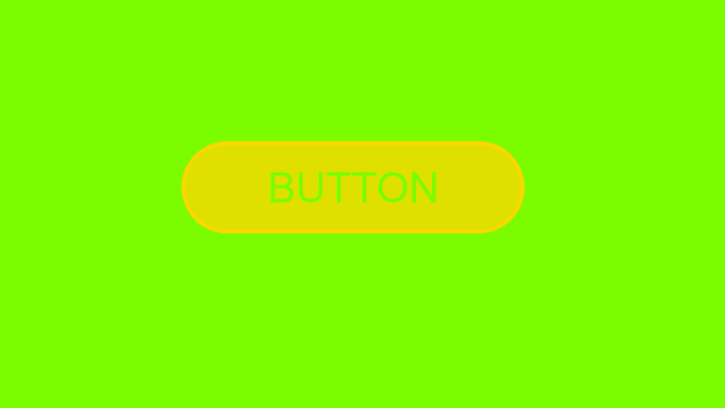
Button Layer Hover Effect code:
1.index.html:
<!DOCTYPE html> <html> <head> <meta charset="UTF-8"> <title>Button Effect</title> <link rel="stylesheet" type="text/css" href="style.css"> </head> <body> <a href="#" class="btn">Button</a> </body> </html>
2.style.css:
body { margin: 0; padding: 0; background: lawngreen; } .btn { font-family: Arial, Helvetica, sans-serif; text-transform: uppercase; font-size: 30px; width: 240px; height: 60px; border-radius: 80px; line-height: 60px; text-align: center; border: 3px solid gold; display: block; text-decoration: none; margin: 300px auto; color: gold; position: relative; overflow: hidden; background: transparent; transition: 0.3s; } .btn::before { content: ''; width: 100%; height: 100%; position: absolute; background: gold; opacity: 0.5; top: -100%; left: 0; z-index: -1; transition: 0.3s; } .btn::after { content: ''; width: 100%; height: 100%; position: absolute; background: gold; opacity: 0.5; top: -100%; left: 0; z-index: -1; transition: 0.3s; transition-delay: 0.2; } .btn:hover{ color: lawngreen; } .btn:hover::before { top: 0; } .btn:hover::after { top: 0; }