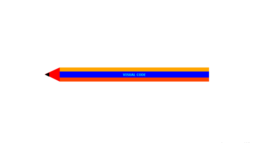
Pencil Shape code:
1.index.html:
<!DOCTYPE html> <html> <head> <meta charset="UTF-8"> <title>Pencil Shape</title> <link rel="stylesheet" href="style.css"> </head> <body> <div class="center"> <div class="pencil"> <p>Visual Code</p> </div> </div> </body> </html>
2.style.css:
body { margin: 0; padding: 0; font-family: Verdana, Geneva, Tahoma, sans-serif; } .center { position: absolute; top: 50%; left: 50%; transform: translate(-50%,-50%); } .pencil { width: 400px; height: 15px; background: blue; border-top: 10px solid orange; border-bottom: 10px solid orangered; } .pencil p { margin: 0; padding: 0; text-align: center; font-size: 8px; line-height: 15px; text-transform: uppercase; font-weight: bold; color: aqua; } .pencil::before { content: ''; position: absolute; left: -80px; top: 0; border-style: solid; border-color: transparent red transparent transparent; border-width: 17px 40px 18px; } .pencil::after { content: ''; position: absolute; left: -80px; top: 0; border-style: solid; border-color: transparent black transparent transparent; border-width: 17px 40px 18px; transform: scale(0.3); } .top { position: absolute; top: 0; right: 0; height: 15px; width: 30px; background: gray; border-top: 10px solid gray; border-bottom: 10px solid gray; } .top::before { content: ''; position: absolute; top: -10px; right: -100%; width: 150%; height: 100%; background: rebeccapurple; border-top: 10px solid rebeccapurple; border-bottom: 10px solid rebeccapurple; border-top-right-radius: 5px; border-bottom-right-radius: 5px; }


