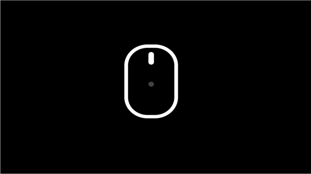
Scroll Down Animation code:
1.index.html:
<!DOCTYPE html> <html> <head> <meta charset="UTF-8"> <title>Scroll Down Animation</title> <link rel="stylesheet" href="style.css"> </head> <body> <div class="center"> <div class="down"></div> </div> </body> </html>
2.style.css:
body { margin: 0; padding: 0; background: black; } .center { position: absolute; top: 50%; left: 50%; transform: translate(-50%,-50%); } .down { position: relative; width: 50px; height: 80px; border-radius: 25px; background: transparent; border: 4px solid white; overflow: hidden; } .down::before { content: ''; position: absolute; width: 6px; height: 6px; border-radius: 50%; background: white; left: 50%; top: 10px; transform: translate(-50%,0); animation: animate 1s linear infinite; } .down::after { content: ''; position: absolute; width: 6px; height: 15px; border-radius: 50%; background: white; left: 50%; top: 5px; transform: translate(-50%,0); border-radius: 3px; } @keyframes animate { 0% { transform: translate(-50%,20px); opacity: 0; } 80% { transform: translate(-50%,60px); opacity: 1; } 100% { transform: translate(-50%,100px); opacity: 0; } }

