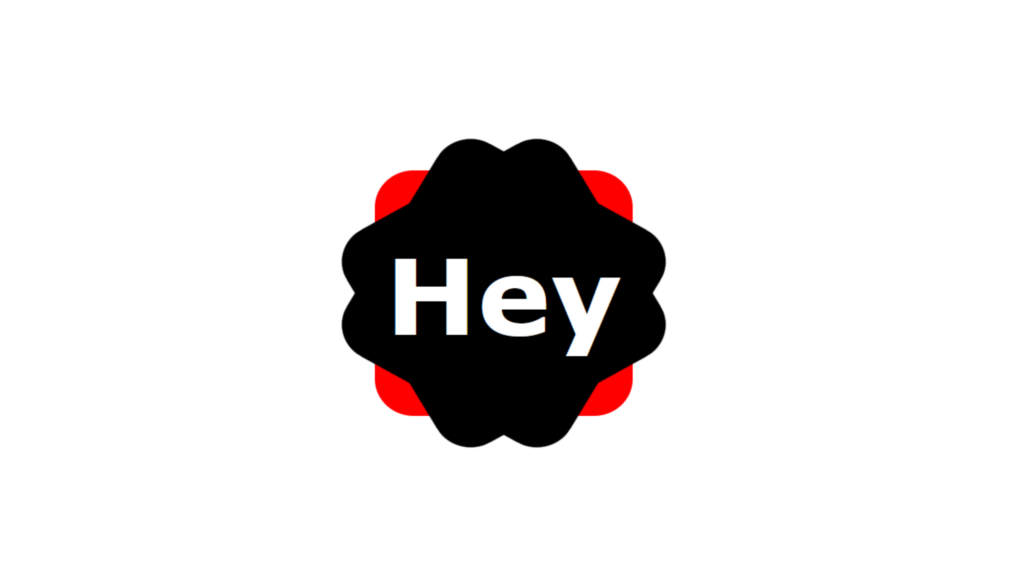
Div Shape Hover Effect code:
1.index.html:
<!DOCTYPE html> <html> <head> <meta charset="UTF-8"> <title>Div Shape</title> <link rel="stylesheet" type="text/css" href="style.css"> </head> <body> <div class="box"> <h1>Hey</h1> </div> </body> </html>
2.style.css:
body { margin: 0; padding: 0; } .box { position: absolute; top: 50%; left: 50%; transform: translate(-50%,-50%); width: 300px; height: 300px; background: red; border-radius: 45px; transition: 0.5s; } .box::before { content: ''; position: absolute; width: 100%; height: 100%; background: black; border-radius: 45px; transform: rotate(30deg); transition: 0.5s; } .box::after { content: ''; position: absolute; width: 100%; height: 100%; background: black; border-radius: 45px; transform: rotate(-30deg); transition: 0.5s; } .box:hover { border-radius: 10px; } .box:hover::before { border-radius: 10px; background: red; transform: rotate(-30deg); } .box:hover::after { border-radius: 10px; background: red; transform: rotate(30deg); } h1{ position: absolute; top: 50%; left: 50%; transform: translate(-50%,-50%); z-index: 1; margin: 0; padding: 0; color: white; font-family: Verdana, Geneva, Tahoma, sans-serif; font-size: 8em; transition: 0.5s; } .box:hover h1 { color: black; }


