Rotation of letters on mouse hover code:
1.index.html:
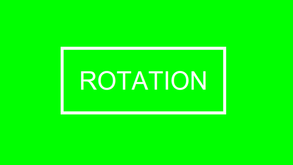
<!DOCTYPE html> <html> <head> <meta charset="UTF-8"> <title>Rotation of letters</title> <link rel="stylesheet" href="style.css"> </head> <body> <ul> <li>R</li> <li>O</li> <li>T</li> <li>A</li> <li>T</li> <li>I</li> <li>O</li> <li>N</li> <div style="clear: both"></div> </ul> </body> </html>
2.style.css:
body { background: rgb(0,255,0); margin: 0; padding: 0; } ul { margin: 0; padding: 50px; border: 10px solid rgb(253,252,252); display: inline-block; position: absolute; top: 50%; left: 50%; transform: translateY(-50%) translateX(-50%); } ul li { list-style: none; color: rgb(253,252,252); float: left; font-size: 5em; font-family: Arial, Helvetica, sans-serif; transition: 0.9s; } ul:hover li { transform: rotate(360deg); } ul:hover li:nth-child(1) { transition-delay: 0.9s; } ul:hover li:nth-child(2) { transition-delay: 0.6s; } ul:hover li:nth-child(3) { transition-delay: 0.3s; }


