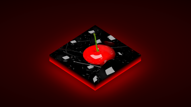
3D Logo Animation Code:
1.index.html:
<!DOCTYPE html> <html> <head> <meta charset="utf-8"> <title>3D Logo Animation</title> <link rel="stylesheet" type="text/css" href="style.css"> </head> <body> ¨K0K </body> </html>
2.style.css: body { margin: 0; padding: 0; } section { width: 100%; height: 100vh; background: radial-gradient(rgb(62, 1, 1),black); } .isometric { position: absolute; top: 50%; left: 50%; width: 500px; height: 500px; background: url(333.png); background-size: cover; transform: translate(-50%,-50%) rotateX(45deg) rotateZ(-45deg); transform-style: preserve-3d; transition: 0.5s; box-shadow: -50px 50px 80px rgba(0,0,0,0.8), -80px 80px 250px rgba(255,0,0,1); animation: animate 2s linear infinite; } .isometric:hover { transform: translate(-50%,-50%) rotateX(0deg) rotateZ(0deg); box-shadow: 0 20px 20px rgba(0,0,0,0.5); animation: none; } .isometric::before { content: ''; width: 100%; height: 50px; position: absolute; bottom: -50px; left: 0; background: linear-gradient(black,red); transform-origin: top; transform: skewX(-45deg) scaleY(1); transition: 0.5s; } .isometric:hover:before { transform: skewX(-45deg) scaleY(0); } .isometric::after { content: ''; width: 50px; height: 100%; position: absolute; top: 50px; left: -50px; background: linear-gradient(to left, black,red); transform-origin: left; transform: skewY(-45deg) scaleY(1); transition: 0.5s; } .isometric:hover:after { top: 0; left: 0; transform: skewY(-45deg) scaleX(0); } @keyframes animate { 0% { box-shadow: -50px 50px 80px rgba(0,0,0,0.8), -80px 80px 250px rgba(255,0,0,1); } 20% { box-shadow: -50px 50px 80px rgba(0,0,0,0.8), -80px 80px 150px rgba(255,0,0,1); } 40% { box-shadow: -50px 50px 80px rgba(0,0,0,0.8), -80px 80px 200px rgba(255,0,0,1); } 60% { box-shadow: -50px 50px 80px rgba(0,0,0,0.8), -80px 80px 120px rgba(255,0,0,1); } 80% { box-shadow: -50px 50px 80px rgba(0,0,0,0.8), -80px 80px 190px rgba(255,0,0,1); } 100% { box-shadow: -50px 50px 80px rgba(0,0,0,0.8), -80px 80px 250px rgba(255,0,0,1); } }

