
Loader Ring Animation code:
1.index.html:
<!DOCTYPE html> <html> <head> <meta charset="utf-8"> <title>Loader Ring Animation</title> <link rel="stylesheet" type="text/css" href="style.css"> </head> <body> ¨K0K </body> </html>
2.style.css:
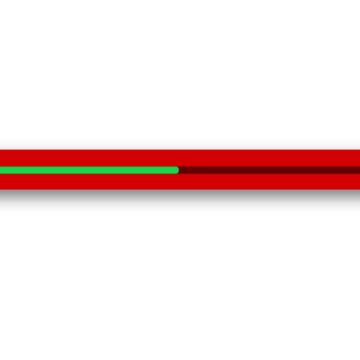
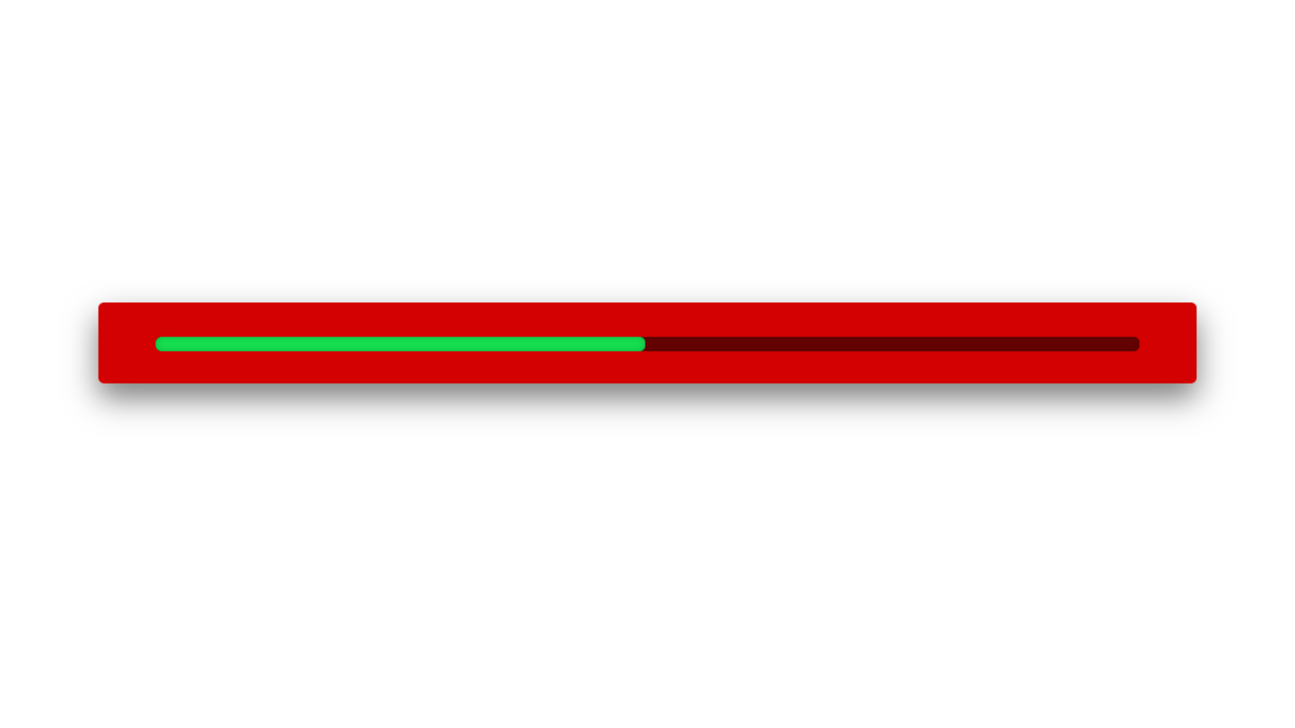
body { margin: 0; padding: 0; background: black; } .ring { position: absolute; top: 50%; left: 50%; transform: translate(-50%,-50%); width: 1500px; height: 1500px; background: transparent; border: 3px solid black; border-radius: 50%; text-align: center; line-height: 150px; font-family: Verdana, Geneva, Tahoma, sans-serif; font-size: 200px; color: red; letter-spacing: 4px; text-transform: uppercase; text-shadow: 0 0 10px red; box-shadow: 0 0 20px rgba(0,0,0,0.5); } .ring::before { content: ''; position: absolute; top: -3px; left: -3px; width: 100%; height: 100%; border: 3px solid transparent; border-top: 3px solid red; border-right: 3px solid red; border-radius: 50%; animation: animate 2s linear infinite; } @keyframes animate { 0% { transform: rotate(0deg); } 100% { transform: rotate(360deg); } } .loader { position: relative; top: 50%; left: 50%; transform: translateX(-50%) translateY(-50%); } .loader span { font-family: Verdana, Geneva, Tahoma, sans-serif; font-size: 150px; display: inline; transition: all 0.5s; animation: animate2 2s infinite; } .loader span:nth-child(1) { animation-delay: 0.1s; } .loader span:nth-child(2) { animation-delay: 0.2s; } .loader span:nth-child(3) { animation-delay: 0.3s; } .loader span:nth-child(4) { animation-delay: 0.4s; } .loader span:nth-child(5) { animation-delay: 0.5s; } .loader span:nth-child(6) { animation-delay: 0.6s; } .loader span:nth-child(7) { animation-delay: 0.7s; } @keyframes animate2 { 0% { color: rgb(255,1,1); transform: translateY(0); margin-left: 0; } 25% { color: rgb(137, 2, 2); transform: translateY(-15px); margin-left: 10px; } 0% { color: rgb(72, 2, 2); transform: translateY(0); } }


