Animation Glow Effects Code:
1.index.html:
<!DOCTYPE html> <html> <head> <meta charset="utf-8"> <title>Animation Glow Effects</title> <link rel="stylesheet" type="text/css" href="style.css"> </head> <body> ¨K0K </body> </html>
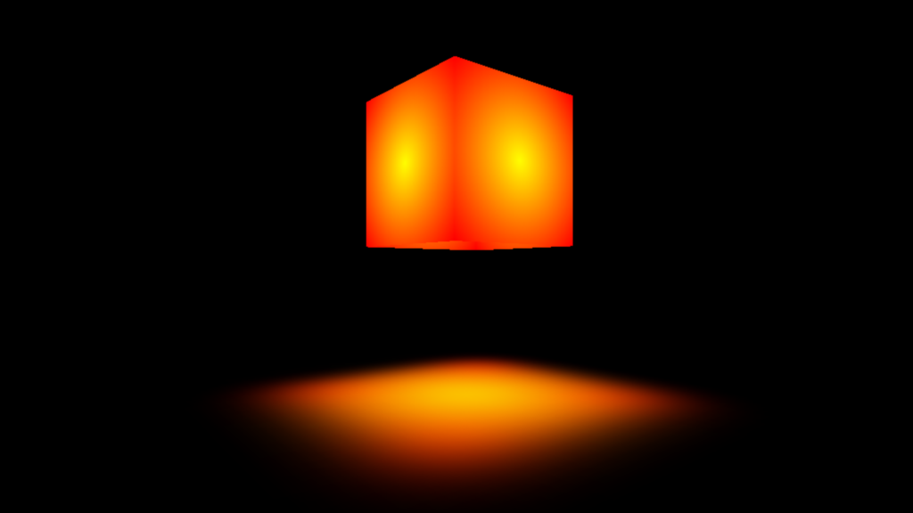
2.style.css: body { margin: 0; padding: 0; box-sizing: border-box; background: black; min-height: 100vh; overflow: hidden; } section { position: absolute; width: 100%; height: 100%; display: flex; justify-content: center; align-items: center; transform-style: preserve-3d; transform: perspective(700px); } .box { position: absolute; transform-style: preserve-3d; top: 300px; } .box .cube { position: relative; width: 200px; height: 200px; transform-style: preserve-3d; animation: animate 20s linear infinite; } @keyframes animate { 0% { transform: rotateY(0deg); } 100% { transform: rotateY(360deg); } } .box .cube div { position: absolute; top: 0; left: 0; width: 100%; height: 100%; transform-style: preserve-3d; } .box .cube div span { position: absolute; top: 0; left: 0; width: 100%; height: 100%; background: radial-gradient(yellow,red); transform: rotateY(calc(90deg * var(--i))) translateZ(100px); } .box .cube .top { position: absolute; top: 0; left: 0; width: 200px; height: 200px; transform: rotateX(90deg) translateZ(100px); display: flex; justify-content: center; align-items: center; } .box .cube .top::before { content: ''; position: absolute; width: 400px; height: 400px; background: radial-gradient(yellow,red); filter: blur(50px); transform: translateZ(-400px); }
