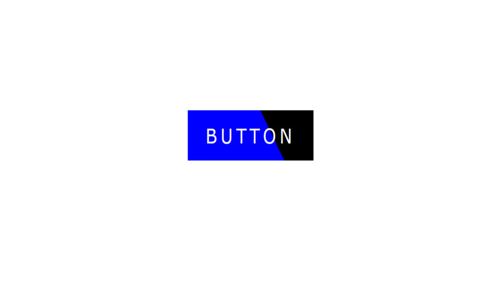
Button Hover Effects code:
1.index.html:
<!DOCTYPE html> <html> <head> <meta charset="UTF-8"> <title>Button Hover Effects</title> <link rel="stylesheet" href="style.css"> </head> <body> <a href="#">Button</a> </body> </html>
2.style.css:
body { margin: 0; padding: 0; } a { position: absolute; top: 50%; left: 50%; transform: translate(-50%,-50%); width: 180px; height: 60px; color: white; background: black; text-align: center; text-decoration: none; text-transform: uppercase; line-height: 60px; font-family: Verdana, Geneva, Tahoma, sans-serif; font-size: 24px; letter-spacing: 5px; transition: 0.5s; overflow: hidden; box-sizing: border-box; } a::before { content: ''; position: absolute; width: 0; height: 0; left: 0; bottom: 0; border-style: solid; border-color: red; border-width: 80px 100px; z-index: -1; transform: rotate(360deg); transition: 1s; transform-origin: left; } a:hover::before { border-color: blue; transform: rotate(60deg); }


