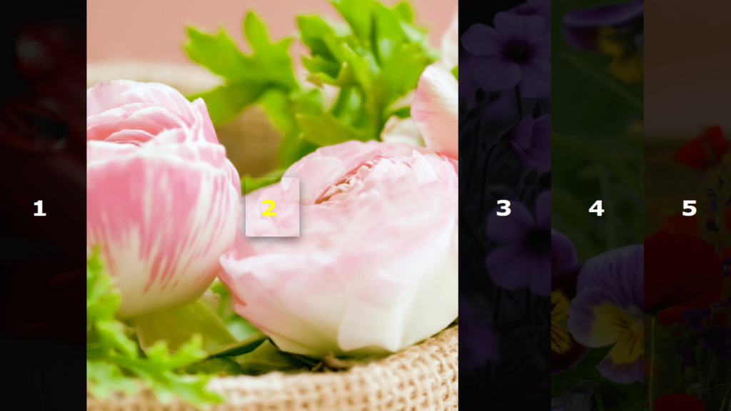
Flex Box Hover Effect Code:
1.index.html:
<!DOCTYPE html> <html> <head> <meta charset="UTF-8"> <title>Flex Box Hover Effect</title> <link rel="stylesheet" href="style.css"> </head> <body> <div class="container"> <div class="box"><h1><span>1</span></h1></div> <div class="box"><h1><span>2</span></h1></div> <div class="box"><h1><span>3</span></h1></div> <div class="box"><h1><span>4</span></h1></div> <div class="box"><h1><span>5</span></h1></div> </div> </body> </html>
2.style.css:
body { margin: 0; padding: 0; font-family: Verdana, Geneva, Tahoma, sans-serif; } .container { width: 100vw; height: 100vh; display: flex; box-sizing: border-box; } .container .box { width: 20vw; text-align: center; line-height: 100vh; flex-grow: 1; background-size: cover; background-position: center; transition: 1s; } h1 { margin: 0; padding: 0; line-height: 100vh; font-size: 2em; background: rgba(0,0,0,0.8); transition: 0.5s; } h1 span { background: rgba(255,255,255,0); width: 100%; transition: 1s; color: white; padding: 25px 20px; text-transform: uppercase; letter-spacing: 2px; } .box:hover h1 span { color: yellow; background: rgba(255,255,255,0); letter-spacing: 10px; box-shadow: 0 5px 15px rgba(0,0,0,0.5); } .box:hover h1 { background: rgba(0,0,0,0); } .box:hover { width: 80vw; } .container .box:nth-child(1) { background: url(1.png); } .container .box:nth-child(2) { background: url(2.png); } .container .box:nth-child(3) { background: url(3.png); } .container .box:nth-child(4) { background: url(4.png); } .container .box:nth-child(5) { background: url(5.png); }


