Animation Effects code:
1.index.html:
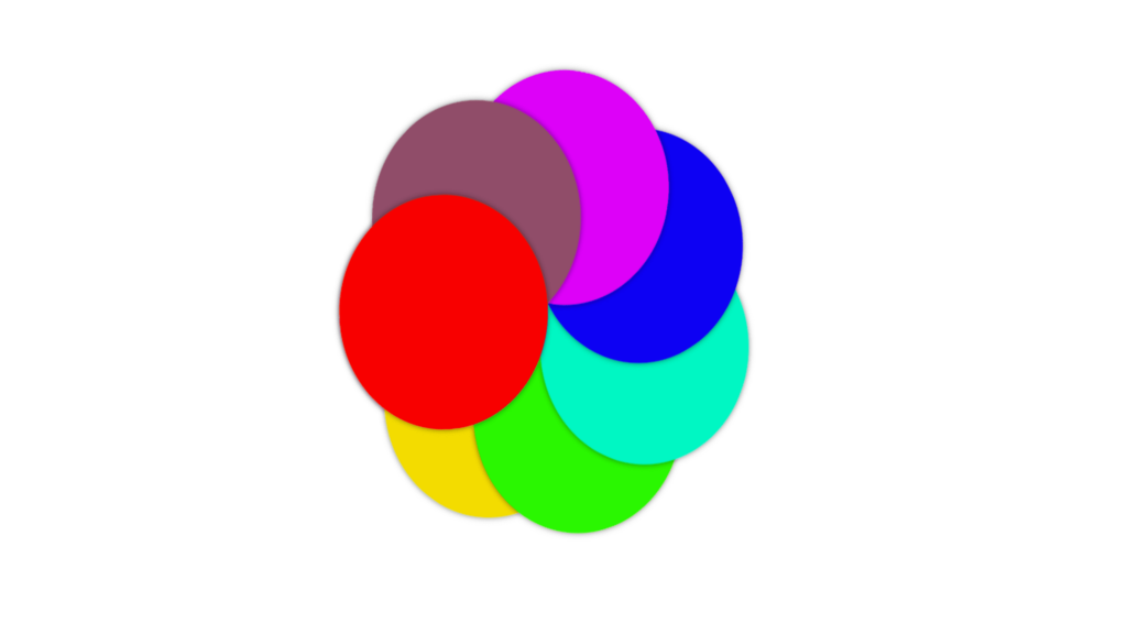
<!DOCTYPE html> <html> <head> <meta charset="UTF-8"> <title>Animation Effects</title> <link rel="stylesheet" href="style.css"> </head> <body> <ul> <li></li> <li></li> <li></li> <li></li> <li></li> <li></li> <li></li> <li></li> </ul> </body> </html>
2.style.css:
body { margin: 0; padding: 0; position: absolute; left: 40%; top: 20%; } ul li { list-style: none; width: 200px; height: 200px; position: absolute; top: 0; border-radius: 50%; box-shadow: 0 0 5px rgba(0,0,0,0.5); transform-origin: bottom center; animation: animate 7s linear infinite; } @keyframes animate { 0% { transform: rotate(0deg); } 100% { transform: rotate(359deg); } } ul li:nth-child(1) { background: rgb(255,255,255); animation-delay: 0s; } ul li:nth-child(2) { background: rgb(243, 219, 4); animation-delay: 1s; } ul li:nth-child(3) { background: rgb(46, 247, 6); animation-delay: 2s; } ul li:nth-child(4) { background: rgb(4, 247, 194); animation-delay: 3s; } ul li:nth-child(5) { background: rgb(21, 5, 243); animation-delay: 4s; } ul li:nth-child(6) { background: rgb(220, 6, 248); animation-delay: 5s; } ul li:nth-child(7) { background: rgb(143, 78, 105); animation-delay: 6s; } ul li:nth-child(8) { background: rgb(248, 3, 3); animation-delay: 7s; }


