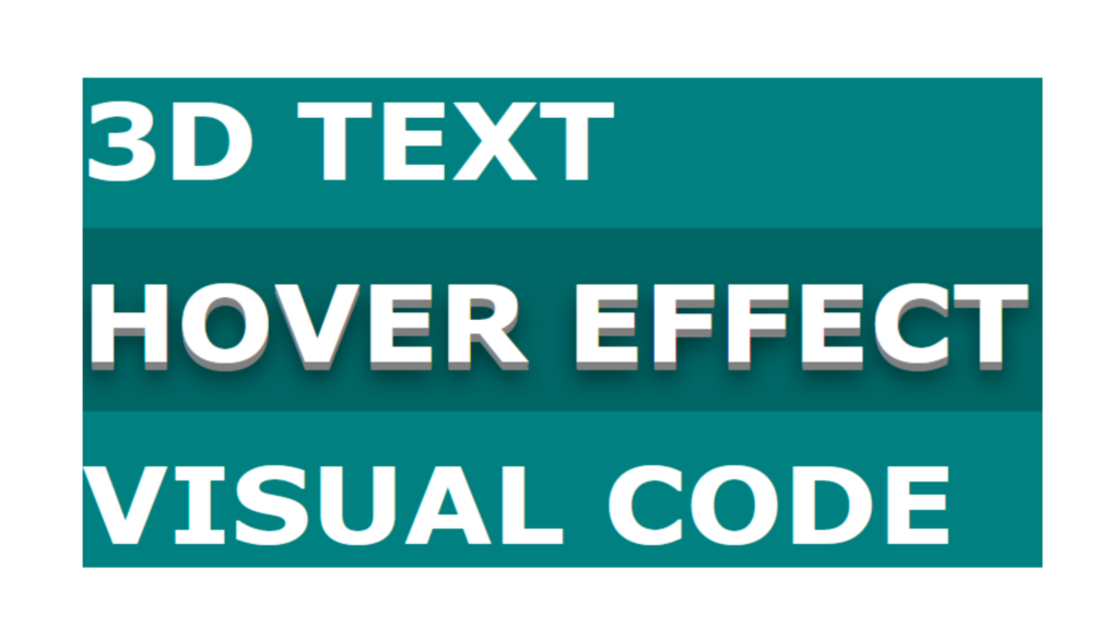
3D Text Hover Effect code:
1.index.html:
<!DOCTYPE html> <html> <head> <meta charset="UTF-8"> <title>3D Text Hover Effect</title> <link rel="stylesheet" type="text/css" href="style.css"> </head> <body> <div class="container"> <h1>3D Text</h1> <h1>Hover Effect</h1> <h1>Visual Code</h1> </div> </body> </html>
2.style.css:
body { margin: 0; padding: 0; background: teal; } .container { position: absolute; top: 50%; transform: translateY(-50%); width: 100%; height: auto; } h1 { margin: 0; padding: 20px 0; font-size: center; font-family: Verdana, Geneva, Tahoma, sans-serif; font-size: 5em; color: white; text-transform: uppercase; transition: 0.5s; } h1:hover { text-shadow: 0 1px 0 gray, 0 2px 0 gray, 0 3px 0 gray, 0 4px 0 gray, 0 5px 0 gray, 0 6px 0 gray, 0 1px 0 gray, 0 12px 15px rgba(0,0,0,0.5); background: rgba(0,0,0,0.2); }

