Animation Button Code:
1.index.html:
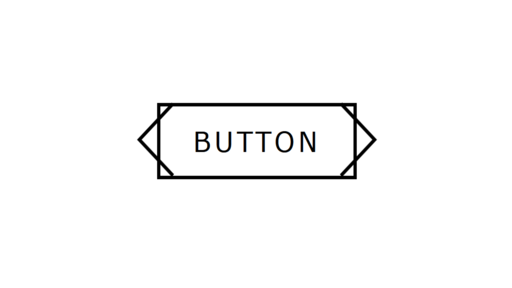
<!DOCTYPE html> <html> <head> <meta charset="UTF-8"> <title>Animation Button</title> <link rel="stylesheet" href="style.css"> </head> <body> <a href="#"><span></span>Button</a> </body> </html>
2.style.css:
body { margin: 0; padding: 0; font-family: Verdana, Geneva, Tahoma, sans-serif; } a { position: absolute; top: 50%; left: 50%; transform: translate(-50%,-50%); padding: 10px 20px; border: 2px solid black; text-decoration: none; text-transform: uppercase; letter-spacing: 2px; color: black; box-sizing: border-box; transition: 0.5s; } a span::before, a span::after { content: ''; position: absolute; display: block; width: 30px; height: 30px; box-sizing: border-box; transition: 0.5s; } a span::before { border-bottom: 2px solid black; border-left: 2px solid black; transform: rotate(45deg); top: 4px; left: -8px; } a:hover span::before { left: -25px; transform: rotate(-135px); animation: animateBefore 0.5s linear infinite; } a span::after { border-top: 2px solid black; border-right: 2px solid black; transform: rotate(45deg); top: 4px; right: -8px; } a:hover span::after { right: -25px; transform: rotate(-135px); animation: animateAfter 0.5s linear infinite; } a:hover { border-radius: 40px; } @keyframes animateBefore { 0% { left: -25px; } 50% { left: -20px; } 100% { left: -25px; } } @keyframes animateAfter { 0% { right: -25px; } 50% { right: -20px; } 100% { right: -25px; } }


