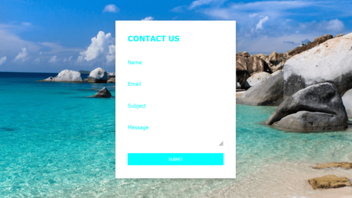
Input Label Slide Up On Hover code:
1.index.html:
<!DOCTYPE html> <html> <head> <meta charset="utf-8"> <title>Input Label Slide Up On Hover</title> <link rel="stylesheet" href="style.css"> </head> <body> ¨K0K </body> </html>
2.style.css:
body { margin: 0; padding: 0; font-family: Verdana, Geneva, Tahoma, sans-serif; background: url(74.png); background-repeat: no-repeat; } .box { position: absolute; top: 50%; left: 50%; transform: translate(-50%,-50%); width: 400px; background: white; padding: 40px; box-sizing: border-box; border: 1px solid rgba(0,0,0,0.1); box-shadow: 0 5px 10px rgba(0,0,0,0.2); } .box h2 { margin: 0 0 40px; padding: 0; color: aqua; text-transform: uppercase; } .box input { padding: 10px 0; margin-bottom: 30px; } .box textarea { height: 80px; padding: 10px 0; margin-bottom: 40px; } .box input, .box textarea { width: 100%; box-sizing: border-box; box-shadow: none; outline: none; border: none; border-bottom: 2px solid white; } .box textarea { margin-bottom: 20px; } .box input[type="submit"] { border-bottom: none; cursor: pointer; background: aqua; color: white; margin-bottom: 0; text-transform: uppercase; } .box form div { position: relative } .box form div label { position: absolute; top: 10px; left: 0; color: aqua; transition: 0.5s; pointer-events: none; } .box input:focus ~ label, .box textarea:focus ~ label, .box input:valid ~ label, .box textarea:valid ~ label { top: -12px; left: 0; color: aqua; font-size: 12px; font-weight: bold; } .box input:focus, .box textarea:focus, .box input:valid, .box textarea:valid { border-bottom: 2px solid aqua; }

