Bitcoin Pulse Animation code: 1.index.html: <!DOCTYPE html> <html> <head> <meta charset="UTF-8"> <title>Bitcoin Pulse Animation</title> <link rel="stylesheet" type="text/css" href="style.css"> <link rel="stylesheet" href="https://cdnjs.cloudflare.com/ajax/libs/font-awesome/4.7.0/css/font-awesome.min.css"> </head> <body> <div class="bitcoin-icon"> <i class="fa fa-btc" style="font-size:48px; color:white"></i> </div> </body> </html> 2.style.css: body { margin: 0; padding: 0; background: url(bit.png); } .bitcoin-icon { position: absolute; top: 50%; left: […]
Архивы по месяцам: Июнь 2022
28 записей
Background Particle Animation code: 1.index.html: <!DOCTYPE html> <html> <head> <meta charset="UTF-8"> <title>Background Particle Animation</title> <link rel="stylesheet" type="text/css" href="style.css"> </head> <body> <div class="container"> <ul> <li></li> <li></li> <li></li> <li></li> <li></li> </ul> </div> </body> </html> 2.style.css: body { margin: 0; padding: 0; } h1 { margin: 0; padding: 0; position: absolute; top: 50%; […]
Custom Animated Checkbox code: 1.index.html: <!DOCTYPE html> <html> <head> <meta charset="UTF-8"> <title>Custom Animated Checkbox</title> <link rel="stylesheet" type="text/css" href="style.css"> </head> <body> <div class="center"> <input type="checkbox" name=""> </div> </body> </html> 2.style.css: body { margin: 0; padding: 0; background: yellow; } .center { position: absolute; top: 50%; left: 50%; transform: translate(-50%,-50%); } input[type="checkbox"] […]
Stretchable Elastic Button code: 1.index.html: <!DOCTYPE html> <html> <head> <meta charset="UTF-8"> <title>Stretchable Elastic Button</title> <link rel="stylesheet" type="text/css" href="style.css"> </head> <body> <a href="#">Button</a> </body> </html> 2.style.css: body { margin: 0; padding: 0; font-family: Verdana, Geneva, Tahoma, sans-serif; background: red; } a { position: absolute; top: 50%; left: 50%; transform: translate(-50%,-50%); padding: […]
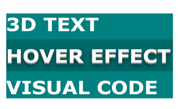
3D Text Hover Effect code: 1.index.html: <!DOCTYPE html> <html> <head> <meta charset="UTF-8"> <title>3D Text Hover Effect</title> <link rel="stylesheet" type="text/css" href="style.css"> </head> <body> <div class="container"> <h1>3D Text</h1> <h1>Hover Effect</h1> <h1>Visual Code</h1> </div> </body> </html> 2.style.css: body { margin: 0; padding: 0; background: teal; } .container { position: absolute; top: 50%; transform: […]
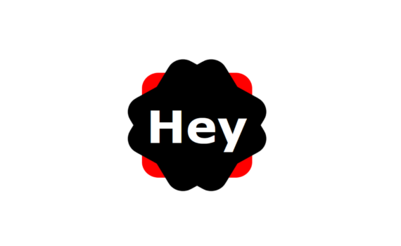
Div Shape Hover Effect code: 1.index.html: <!DOCTYPE html> <html> <head> <meta charset="UTF-8"> <title>Div Shape</title> <link rel="stylesheet" type="text/css" href="style.css"> </head> <body> <div class="box"> <h1>Hey</h1> </div> </body> </html> 2.style.css: body { margin: 0; padding: 0; } .box { position: absolute; top: 50%; left: 50%; transform: translate(-50%,-50%); width: 300px; height: 300px; background: red; […]
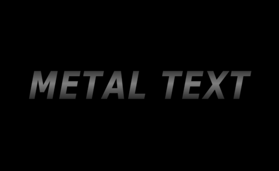
Metal Text code: 1.index.html: <!DOCTYPE html> <html> <head> <meta charset="UTF-8"> <title>Metal Text</title> <link rel="stylesheet" type="text/css" href="style.css"> </head> <body> <h1> <span>Metal Text</span> <span>Metal Text</span> </h1> </body> </html> 2.style.css: body { margin: 0; padding: 0; background: black; background-size: cover; } h1>span { position: absolute; top: 50%; transform: translateY(-50%); margin: 0; padding: 0; […]
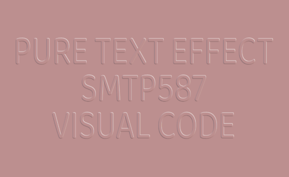
Pure Text Effect code: 1.index.html: <!DOCTYPE html> <html> <head> <meta charset="UTF-8"> <title>Pure Text Effect</title> <link rel="stylesheet" type="text/css" href="style.css"> </head> <body> <div class="center"> <div class="text">Pure Text Effect</div> <div class="text">Smtp587</div> <div class="text">Visual code</div> </div> </body> </html> 2.style.css: @import url('https://fonts.googleapis.com/css2?family=Baloo+Chettan+2:wght@400;800&family=Fascinate&family=Kdam+Thmor+Pro&family=Oswald:wght@200&display=swap'); body { margin: 0; padding: 0; font-family: 'Baloo Chettan 2', cursive; background: rosybrown; […]
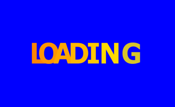
Loading Text Animation code: 1.index.html: <!DOCTYPE html> <html> <head> <meta charset="UTF-8"> <title>Loading Text Animation</title> <link rel="stylesheet" type="text/css" href="style.css"> </head> <body> <ul> <li>L</li> <li>O</li> <li>A</li> <li>D</li> <li>I</li> <li>N</li> <li>G</li> </ul> </body> </html> 2.style.css: body { margin: 0; padding: 0; font-family: Verdana, Geneva, Tahoma, sans-serif; font-weight: bold; background: blue; } ul { […]
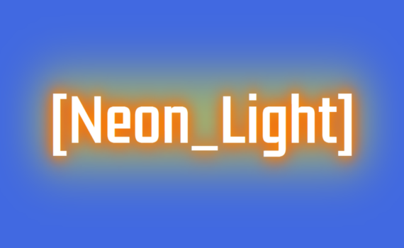
Neon Light Text Effect code: 1.index.html: <!DOCTYPE html> <html> <head> <meta charset="UTF-8"> <title>Neon Light Text Effect</title> <link rel="stylesheet" type="text/css" href="style.css"> </head> <body> <h1 class="neon" data-text="[Neon_Light]">[Neon_Light]</h1> </body> </html> 2.style.css: @import url('https://fonts.googleapis.com/css2?family=Fascinate&family=Kdam+Thmor+Pro&family=Oswald:wght@200&display=swap'); body { margin: 0; padding: 0; background: royalblue; background-size: cover; font-family: 'Kdam Thmor Pro', sans-serif; } .neon { position: absolute; […]