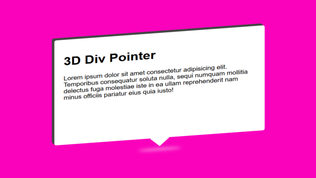
3D Div Pointer Code:
1.index.html:
<!DOCTYPE html> <html> <head> <meta charset="UTF-8"> <title>3D Div Pointer</title> <link rel="stylesheet" type="text/css" href="style.css"> </head> <body> <div class="container"> <h1>3D Div Pointer</h1> <p>Lorem ipsum dolor sit amet consectetur adipisicing elit. Temporibus consequatur soluta nulla, sequi numquam mollitia delectus fuga molestiae iste in ea ullam reprehenderit nam minus officiis pariatur eius quia iusto!</p> </div> </body> </html>
2.style.css:
body { margin: 0; padding: 0; background: rgb(250,2,188); } .container { width: 500px; height: 300px; background: rgb(255,255,255); position: absolute; top: 50%; left: 50%; transform: translate(-50% , -50%) skewY(-5deg); padding: 20px; border: 2px solid rgb(255,255,255); border-radius: 5px; box-sizing: border-box; font-family: Arial, Helvetica, sans-serif; transition: 0.5s; box-shadow: -1px -1px 0 rgb(68,68,68), -2px -2px 0 rgb(68,68,68), -3px -3px 0 rgb(68,68,68), -4px -4px 0 rgb(68,68,68), -5px -5px 0 rgb(68,68,68), -6px -6px 0 rgb(68,68,68); } .container:hover { transform: translate(-50% , -50%) skewY(5deg); box-shadow: 1px -1px 0 rgb(68,68,68), 2px -2px 0 rgb(68,68,68), 3px -3px 0 rgb(68,68,68), 4px -4px 0 rgb(68,68,68), 5px -5px 0 rgb(68,68,68), 6px -6px 0 rgb(68,68,68); } .container p { margin: 0; padding: 0; color: rgb(0,0,0); } .container:before { content: ''; position: absolute; width: 30px; height: 30px; background: rgb(255,255,255); bottom: 0; left: 50%; transform: translateX(-50%) translateY(18px) rotate(45deg); border-bottom: 2px solid rgb(255,255,255); border-right: 2px solid rgb(255,255,255); } .container:after { content: ''; width: 100px; height: 4px; background: rgb(255,255,255); border-radius: 50%; position: absolute; bottom: 0; left: 50%; transform: translateX(-50%) translateY(36px); filter: blur(5px); }

