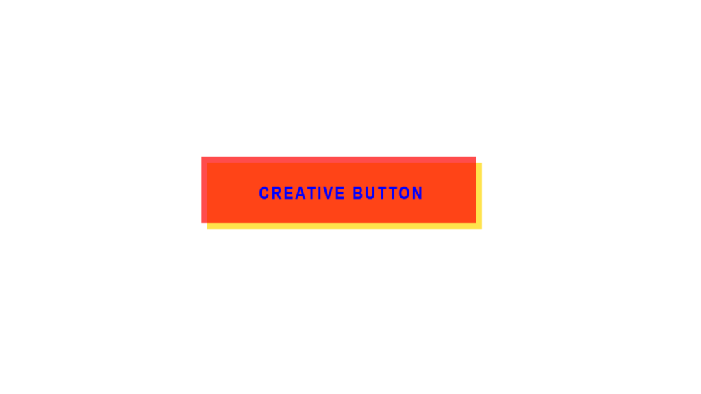
Creative Button code:
1.index.html:
<!DOCTYPE html> <html> <head> <meta charset="UTF-8"> <title>Creative Button</title> <link rel="stylesheet" type="text/css" href="style.css"> </head> <body> <a href="#">Creative Button</a> </body> </html>
2.style.css:
body { margin: 0; padding: 0; } a { position: absolute; top: 50%; left: 50%; transform: translate(-50%, -50%); font-family: Arial, Helvetica, sans-serif; text-transform: uppercase; text-decoration: none; color: blue; background: transparent; width: 300px; height: 60px; text-align: center; line-height: 60px; font-weight: bold; letter-spacing: 2px; z-index: 1; } a::before { content: ''; position: absolute; width: 100%; height: 100%; background: red; opacity: 0.7; z-index: -1; mix-blend-mode: multiply; transform-origin: top; transition: 0.2s; top: -3px; left: -3px; } a::after { content: ''; position: absolute; width: 100%; height: 100%; background: gold; opacity: 0.7; z-index: -1; mix-blend-mode: multiply; transform-origin: bottom; transition: 0.2s; bottom: -3px; right: -3px; } a:hover::before { top: -6px; left: 0; transform: perspective(1000px) rotateX(80deg); } a:hover::after { top: -6px; left: 0; transform: perspective(1000px) rotateX(-80deg); } a:hover { color: red; }
