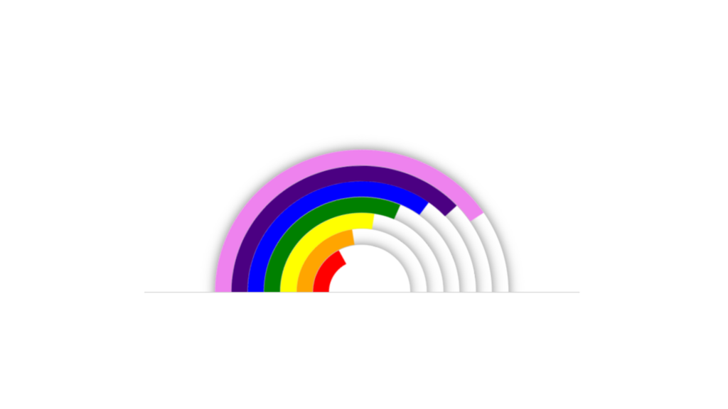
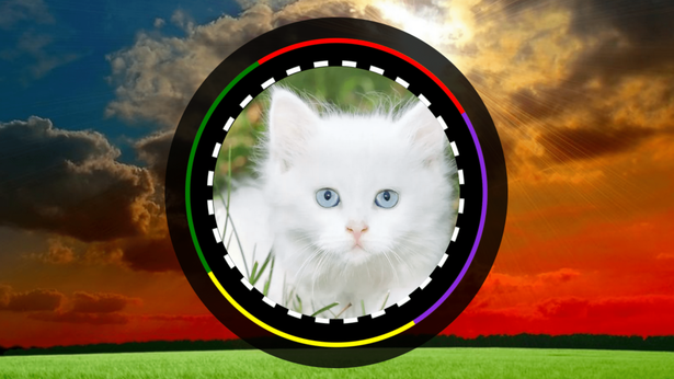
Rainbow Animation code:
1.index.html:
<!DOCTYPE html> <html> <head> <meta charset="UTF-8"> <title>Rainbow Animation</title> <link rel="stylesheet" href="style.css"> </head> <body> <div class="center"> <ul> <li></li> <li></li> <li></li> <li></li> <li></li> <li></li> <li></li> </ul> </div> </body> </html>
2.style.css:
body { margin: 0; padding: 0; } .center { position: absolute; top: 50%; left: 50%; transform: translate(-50%, -50%); } ul { margin: 0; padding: 0; position: relative; width: 400px; height: 240px; overflow: hidden; border-bottom: 1px solid rgba(0,0,0,0.2); } ul li { list-style: none; border-radius: 50%; border: 15px solid black; position: absolute; top: 100%; left: 50%; border-bottom-color: transparent !important; border-left-color: transparent !important; box-shadow: 0 0 10px rgba(0,0,0,0.5); animation: animate 5s infinite alternate; transform: translate(-50%, -50%); } ul li:nth-child(1) { width: 60px; height: 60px; border-color: red; animation-delay: 0.2s; } ul li:nth-child(2) { width: 90px; height: 90px; border-color: orange; animation-delay: 0.4s; } ul li:nth-child(3) { width: 120px; height: 120px; border-color: yellow; animation-delay: 0.6s; } ul li:nth-child(4) { width: 150px; height: 150px; border-color: green; animation-delay: 0.8s; } ul li:nth-child(5) { width: 180px; height: 180px; border-color: blue; animation-delay: 1s; } ul li:nth-child(6) { width: 210px; height: 210px; border-color: indigo; animation-delay: 1.2s; } ul li:nth-child(7) { width: 240px; height: 240px; border-color: violet; animation-delay: 1.4s; } @keyframes animate { 0% { transform: translate(-50%,-50%) rotate(-45deg); } 100% { transform: translate(-50%,-50%) rotate(315deg); } }
