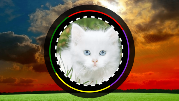
Circle Logo Animation Code:
1.index.html:
<!DOCTYPE html> <html> <head> <meta charset="UTF-8"> <title>Circle Logo Animation</title> <link rel="stylesheet" href="style.css"> </head> <body> <div class="center"> <div class="circle1"></div> <div class="circle2"></div> <div class="circle3"></div> </div> </body> </html>
2.style.css:
body { margin: 0; padding: 0; background: url(1.png); background-size: cover; } .center { position: absolute; top: 50%; left: 50%; transform: translate(-50%, -50%); width: 250px; height: 250px; box-sizing: border-box; border: 15px solid rgba(0,0,0,0.8); border-radius: 50%; } .circle1 { width: 100%; height: 100%; border-radius: 50%; border-style: solid; border-color: yellow green red blueviolet; box-sizing: border-box; animation: animateCircle1 5s linear infinite; background: black; } .circle2 { position: absolute; top: 16px; left: 16px; width: calc(100% - 40px); height: calc(100% - 40px); border-radius: 50%; border: 4px dashed white; animation: animateCircle2 10s linear infinite; } .circle3 { position: absolute; top: 20px; left: 20px; width: calc(100% - 40px); height: calc(100% - 40px); border-radius: 50%; background: url(2.png); background-size: cover; } @keyframes animateCircle1 { 0% { transform: rotate(0deg); } 100% { transform: rotate(360deg); } } @keyframes animateCircle2 { 0% { transform: rotate(360deg); } 100% { transform: rotate(0deg); } }