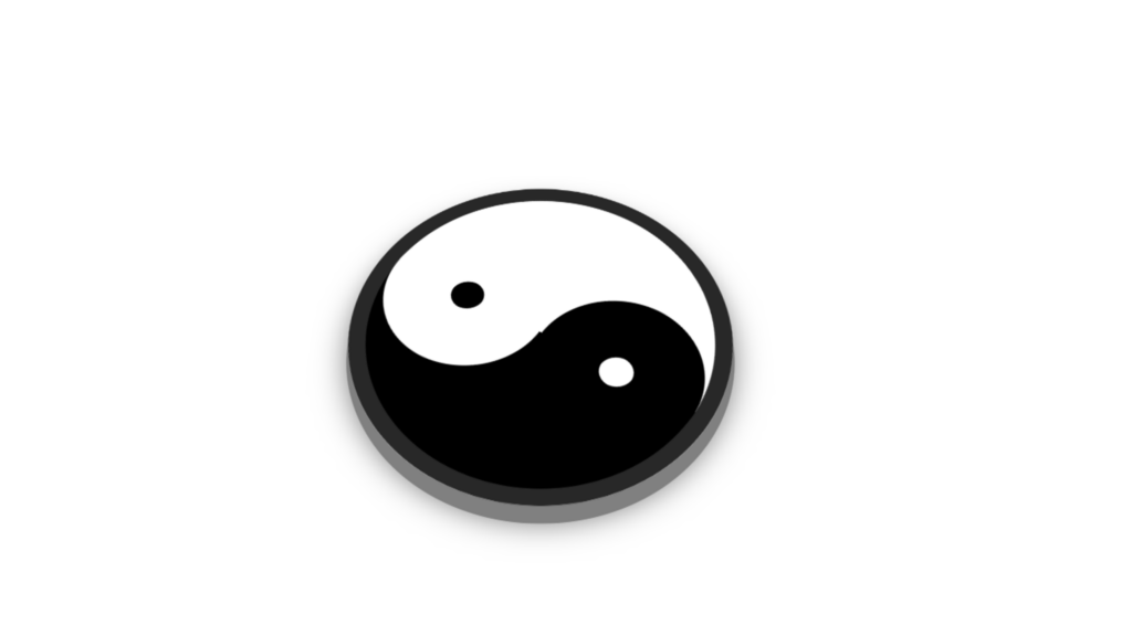
Animated Shape Yin and Yang code:
1.index.html:
<!DOCTYPE html> <html> <head> <meta charset="UTF-8"> <title>Yin and Yang</title> <link rel="stylesheet" href="style.css"> </head> <body> <div class="center"> <div class="shape"> </div> </div> </body> </html>
2.style.css:
body { margin: 0; padding: 0; } .center { position: absolute; top: 50%; left: 50%; transform: translate(-50%,-50%) perspective(800px) rotateX(45deg); background: black; border-radius: 50%; border: 10px solid rgb(40,40,40); box-shadow: 0 10px 0 gray, 0 10px 15px rgba(0,0,0,0.5); } .shape { width: 200px; height: 100px; border-bottom: 100px solid white; border-radius: 50%; animation: animate 5s linear infinite; } .shape::before { content: ''; position: absolute; top: 50%; right: 0%; width: 20px; height: 20px; background: black; border: 40px solid white; border-radius: 50%; } .shape::after { content: ''; position: absolute; top: 50%; left: 0%; width: 20px; height: 20px; background: white; border: 40px solid black; border-radius: 50%; } @keyframes animate { 0% { transform: rotate(360deg); } 100% { transform: rotate(0deg); } }
