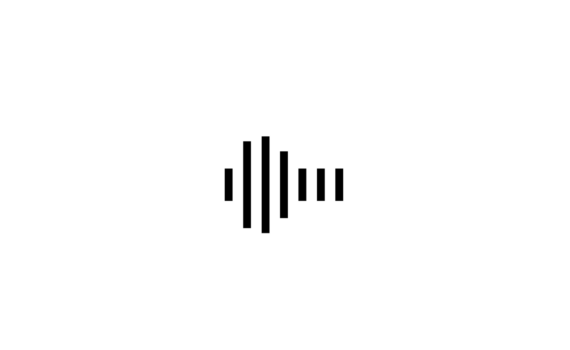
Loading Animation code: 1.index.html: <!DOCTYPE html> <html> <head> <meta charset="UTF-8"> <title>Loading Animation</title> <link rel="stylesheet" href="style.css"> </head> <body> <ul> <li></li> <li></li> <li></li> <li></li> <li></li> <li></li> <li></li> </ul> </body> </html> 2.style.css: body { margin: 0; padding: 0; } ul { position: absolute; top: 50%; left: 50%; transform: translate(-50%,-50%); display: flex; } ul […]
Архивы по месяцам: Апрель 2022
17 записей
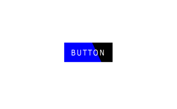
Button Hover Effects code: 1.index.html: <!DOCTYPE html> <html> <head> <meta charset="UTF-8"> <title>Button Hover Effects</title> <link rel="stylesheet" href="style.css"> </head> <body> <a href="#">Button</a> </body> </html> 2.style.css: body { margin: 0; padding: 0; } a { position: absolute; top: 50%; left: 50%; transform: translate(-50%,-50%); width: 180px; height: 60px; color: white; background: black; text-align: […]
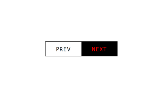
Button Hover Effect code: 1.index.html: <!DOCTYPE html> <html> <head> <meta charset="UTF-8"> <title>Button Hover Effect</title> <link rel="stylesheet" href="style.css"> </head> <body> <ul> <li><a href="#">Prev</a></li> <li><a href="#">Next</a></li> </ul> </body> </html> 2.style.css: body body { margin: 0; padding: 0; } ul { position: absolute; top: 50%; left: 50%; transform: translate(-50%,-50%); display: flex; margin: 0; […]
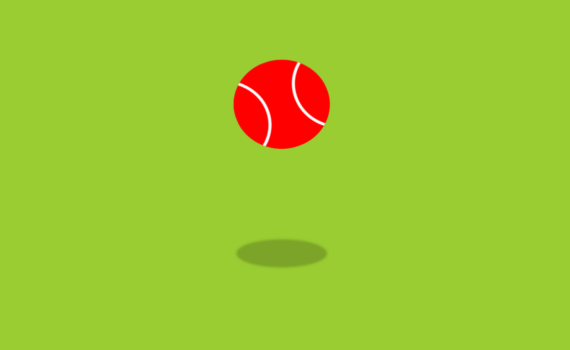
Animated Tennis Ball code: 1.index.html: <!DOCTYPE html> <html> <head> <meta charset="UTF-8"> <title>Animated Tennis Ball</title> <link rel="stylesheet" href="style.css"> </head> <body> <div class="center"> <div class="ball"></div> <div class="shadow"></div> </div> </body> </html> 2.style.css: body { margin: 0; padding: 0; background: yellowgreen; } .center { position: absolute; top: 50%; left: 50%; transform: translate(-50%,-50%); } .ball […]
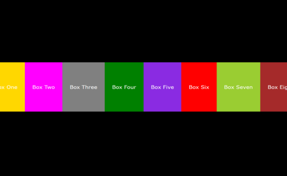
Flex Box Hover Effect code: 1.index.html: <!DOCTYPE html> <html> <head> <meta charset="UTF-8"> <title>Flex Box Hover Effect</title> <link rel="stylesheet" href="style.css"> </head> <body> <div class="container"> <div class="box">Box One</div> <div class="box">Box Two</div> <div class="box">Box Three</div> <div class="box">Box Four</div> <div class="box">Box Five</div> <div class="box">Box Six</div> <div class="box">Box Seven</div> <div class="box">Box Eight</div> </div> </body> </html> […]
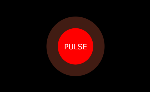
Pulse Animation code: 1.index.html: <!DOCTYPE html> <html> <head> <meta charset="UTF-8"> <title>Pulse Animation</title> <link rel="stylesheet" href="style.css"> </head> <body> <div class="center"> <div class="pulse">pulse</div> </div> </body> </html> 2.style.css: body { margin: 0; padding: 0; background: black; } .center { position: absolute; top: 50%; left: 50%; transform: translate(-50%,-50%); } .pulse { width: 100px; height: […]
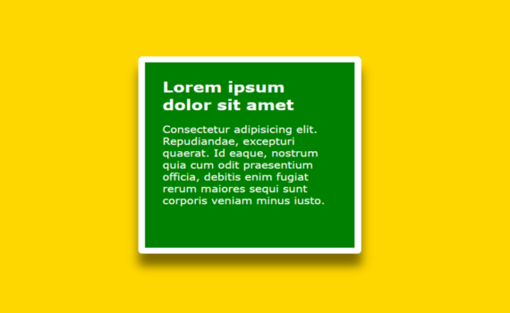
Div Hover Effect code: 1.index.html: <!DOCTYPE html> <html> <head> <meta charset="UTF-8"> <title>Div Hover Effect</title> <link rel="stylesheet" href="style.css"> </head> <body> <div class="center"> <div class="box"> <h1>Lorem ipsum dolor sit amet</h1> <p>Consectetur adipisicing elit. Repudiandae, excepturi quaerat. Id eaque, nostrum quia cum odit praesentium officia, debitis enim fugiat rerum maiores sequi sunt corporis […]
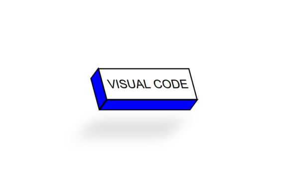
3D Skewed Button code: 1.index.html: <!DOCTYPE html> <html> <head> <meta charset="UTF-8"> <title>3D Skewed Button</title> <link rel="stylesheet" href="style.css"> </head> <body> <div class="center"> <a href="#"><span></span><span></span>Visual Code</a> </div> </body> </html> 2.style.css: body { margin: 0; padding: 0; font-family: Arial, Helvetica, sans-serif; } .center { position: absolute; top: 50%; left: 50%; transform: translate(-50%,-50%); } […]

Smoke Text Animation code: 1.index.html: <!DOCTYPE html> <html> <head> <meta charset="UTF-8"> <title>Smoke Text Animation</title> <link rel="stylesheet" href="style.css"> </head> <body> <div class="center"> <ul> <li>S</li> <li>M</li> <li>O</li> <li>K</li> <li>E</li> </ul> </div> </body> </html> 2.style.css: body { margin: 0; padding: 0; background: black; font-family: Verdana, Geneva, Tahoma, sans-serif; } .center { position: absolute; […]
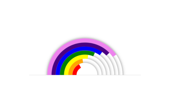
Rainbow Animation code: 1.index.html: <!DOCTYPE html> <html> <head> <meta charset="UTF-8"> <title>Rainbow Animation</title> <link rel="stylesheet" href="style.css"> </head> <body> <div class="center"> <ul> <li></li> <li></li> <li></li> <li></li> <li></li> <li></li> <li></li> </ul> </div> </body> </html> 2.style.css: body { margin: 0; padding: 0; } .center { position: absolute; top: 50%; left: 50%; transform: translate(-50%, -50%); […]