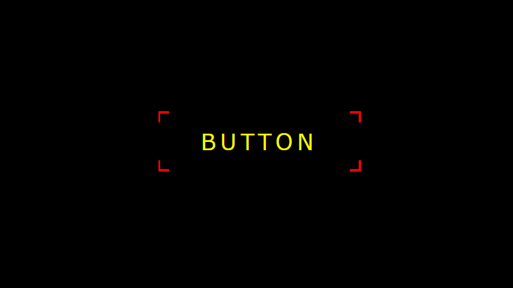
Button Border Animation code:
1.index.html:
<!DOCTYPE html> <html> <head> <meta charset="UTF-8"> <title>Button Hover Effect</title> <link rel="stylesheet" href="style.css"> </head> <body> <a href="#"><span></span>Button</a> </body> </html>
2.style.css:
body { margin: 0; padding: 0; background: black; } a { position: absolute; top: 50%; left: 50%; transform: translate(-50%,-50%); width: 180px; height: 50px; background: black; text-transform: uppercase; text-align: center; line-height: 50px; color: yellow; text-decoration: none; font-size: 20px; font-family: Verdana, Geneva, Tahoma, sans-serif; letter-spacing: 4px; } a::before, a::after, span::before, span::after { content: ''; position: absolute; width: 10px; height: 10px; background: red; transition: 1s; mix-blend-mode: hue; } a::before { top: -2px; left: -2px; } a::after { top: -2px; right: -2px; } span::before { bottom: -2px; left: -2px; } span::after { bottom: -2px; right: -2px; } a:hover:before, a:hover:after, a:hover span::before, a:hover span::after { width: calc( 180px / 2); height: calc( 50px / 2); }

