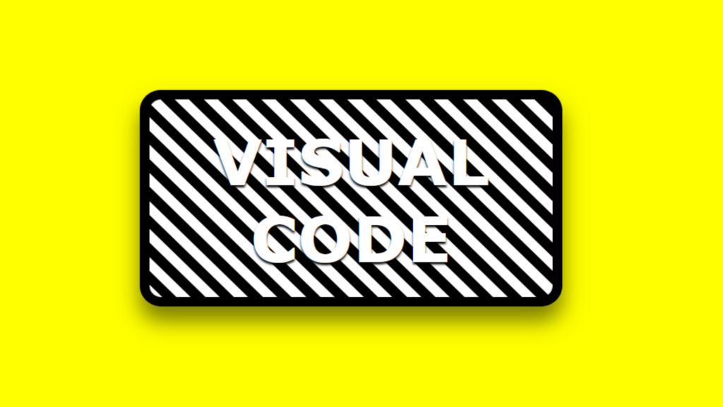
Animated Gradient code:
1.index.html:
<!DOCTYPE html> <html> <head> <meta charset="UTF-8"> <title>Animated Gradient</title> <link rel="stylesheet" type="text/css" href="style.css"> </head> <body> <div class="box"> <h1>Visual Code</h1> </div> </body> </html>
2.style.css:
body { margin: 0; padding: 0; background: yellow; } .box { position: absolute; top: 50%; left: 50%; transform: translate(-50%,-50%); width: 396px; height: 200px; border: 10px solid black; border-radius: 20px; box-shadow: 0 15px 20px rgba(0,0,0,0.5); background-image: repeating-linear-gradient(45deg, black, black 10px,white 10px,white 20px); animation: animate 5s linear infinite; } h1 { position: relative; top: 50%; transform: translateY(-50%); margin: 0; padding: 0; text-align: center; font-family: Verdana, Geneva, Tahoma, sans-serif; text-transform: uppercase; font-size: 4em; color: white; text-shadow: 0 2px 2px rgba(0,0,0,1); } @keyframes animate { 0% { background-position: 0; } 100% { background-position: 400px; } }
