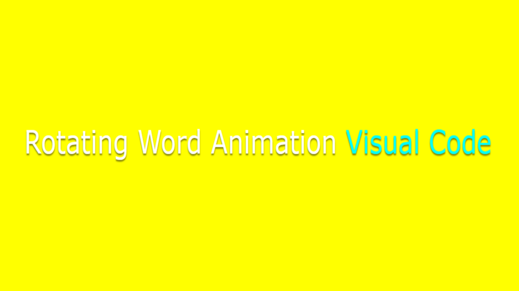
Rotating Word Animation code:
1.index.html:
<!DOCTYPE html> <html> <head> <meta charset="UTF-8"> <title>Rotating Word</title> <link rel="stylesheet" type="text/css" href="style.css"> </head> <body> <div class="box"> Rotating Word Animation <div class="word"> <span>Rotating</span> <span>Word</span> <span>Animation</span> <span>Visual Code</span> </div> </div> </body> </html>
2.style.css:
body { margin: 0; padding: 0; background: yellow; } .box { position: absolute; top: 50%; transform: translateY(-50%); font-size: 3em; font-family: Verdana, Geneva, Tahoma, sans-serif; color: white; margin-left: 50px; width: calc(100% - 50px); text-shadow: 0 2px 2px rgba(0,0,0,0.5); } .word { display: inline-block; color: aqua; } .word span { position: absolute; top: 0; overflow: hidden; animation: animate 10s linear infinite; } @keyframes animate { 0% { opacity: 0; transform: translateY(-50px); } 2% { opacity: 1; transform: translateY(0px); } 18% { opacity: 1; transform: translateY(0px); } 20% { opacity: 0; transform: translateY(50px); } 100% { opacity: 0; transform: translateY(50px); } } .word span:nth-child(1) { animation-delay: 0s; } .word span:nth-child(2) { animation-delay: 2s; } .word span:nth-child(3) { animation-delay: 4s; } .word span:nth-child(4) { animation-delay: 6s; }

