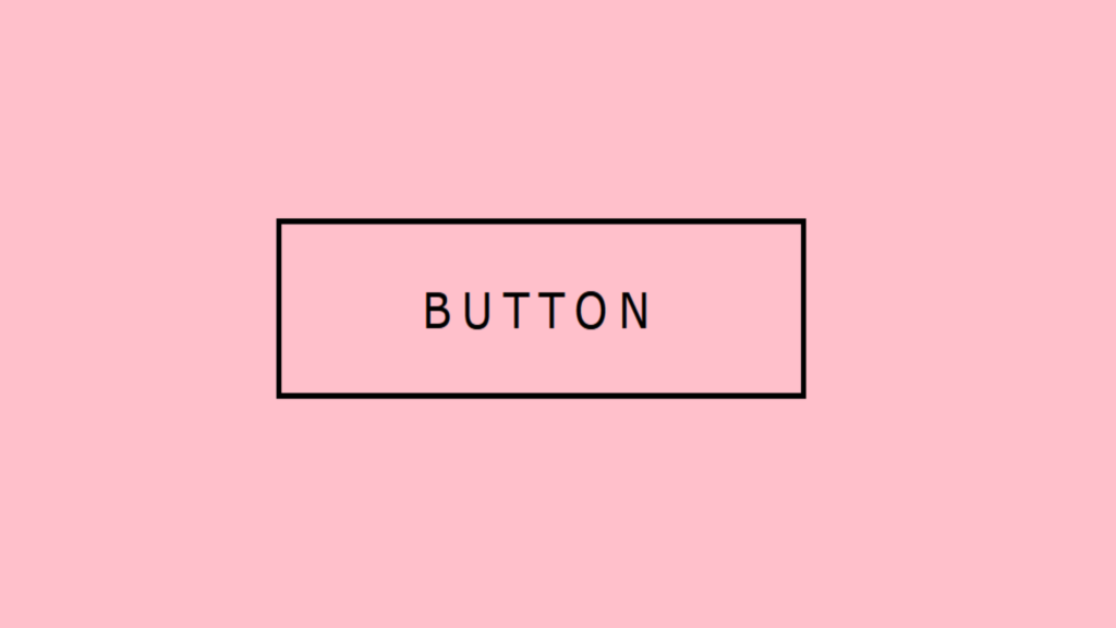
Border Around Button Hover Effect code:
1.index.html:
<!DOCTYPE html> <html> <head> <meta charset="UTF-8"> <title>Border Around Button</title> <link rel="stylesheet" type="text/css" href="style.css"> </head> <body> <a href="#">Button <span></span> <span></span> <span></span> <span></span> </a> </body> </html>
2.style.css:
body { margin: 0; padding: 0; background: pink; } a { position: absolute; top: 50%; left: 50%; transform: translate(-50%,-50%); width: 200px; height: 60px; line-height: 60px; background: transparent; text-align: center; text-transform: uppercase; text-decoration: none; letter-spacing: 4px; font-family: Verdana, Geneva, Tahoma, sans-serif; color: black; overflow: hidden; } a span { display: block; background: black; transition: 0.2s; } a span:nth-child(1), a span:nth-child(3) { position: absolute; height: 2px; width: 100%; } a span:nth-child(2), a span:nth-child(4) { position: absolute; height: 100%; width: 2px; } a span:nth-child(1) { top: 0; left: -100%; transition-delay: 0s; } a span:nth-child(2) { top: -100%; right: 0; transition-delay: 0.2s; } a span:nth-child(3) { bottom: 0; right: -100%; transition-delay: 0.4s; } a span:nth-child(4) { bottom: -100%; left: 0; transition-delay: 0.6s; } a:hover span:nth-child(1) { top: 0; left: 0; } a:hover span:nth-child(2) { top: 0; right: 0; } a:hover span:nth-child(3) { bottom: 0; right: 0; } a:hover span:nth-child(4) { bottom: 0; left: 0; }

