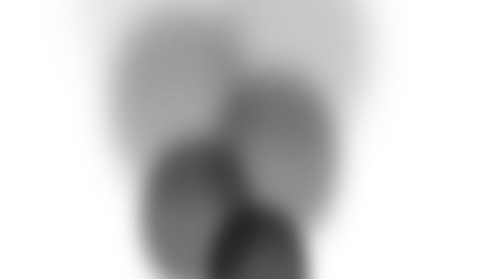
Smoke Animation code:
1.index.html:
<!DOCTYPE html> <html> <head> <meta charset="UTF-8"> <title>Smoke Animation</title> <link rel="stylesheet" type="text/css" href="style.css"> </head> <body> <ul> <li></li> <li></li> <li></li> <li></li> <li></li> <li></li> <li></li> <li></li> <li></li> <li></li> </ul> </body> </html>
2.style.css:
body { margin: 0; padding: 0; } ul { position: absolute; bottom: 0; left: 50%; transform: translateX(-50%); margin: 0; padding: 0; } li { position: absolute; list-style: none; width: 80px; height: 80px; background: black; border-radius: 50%; } li:nth-child(even) { animation: animateEven 2.7s linear infinite; } li:nth-child(odd) { animation: animateOdd 2.7s linear infinite; } @keyframes animateOdd { 0% { transform: translate(0,0) scale(1); opacity: 1; filter: blur(5px); } 100% { transform: translate(-100px,-500px) scale(3); opacity: 0; filter: blur(10px); } } @keyframes animateEven { 0% { transform: translate(0,0) scale(1); opacity: 1; filter: blur(5px); } 100% { transform: translate(100px,-500px) scale(3); opacity: 0; filter: blur(10px); } } li:nth-child(1) { animation-delay: 0s; } li:nth-child(2) { animation-delay: 0.3s; } li:nth-child(3) { animation-delay: 0.6s; } li:nth-child(4) { animation-delay: 0.9s; } li:nth-child(5) { animation-delay: 1.2s; } li:nth-child(6) { animation-delay: 1.5s; } li:nth-child(7) { animation-delay: 1.8s; } li:nth-child(8) { animation-delay: 2.1s; } li:nth-child(9) { animation-delay: 2.7s; } li:nth-child(10) { animation-delay: 3s; }
